
THE BREIF
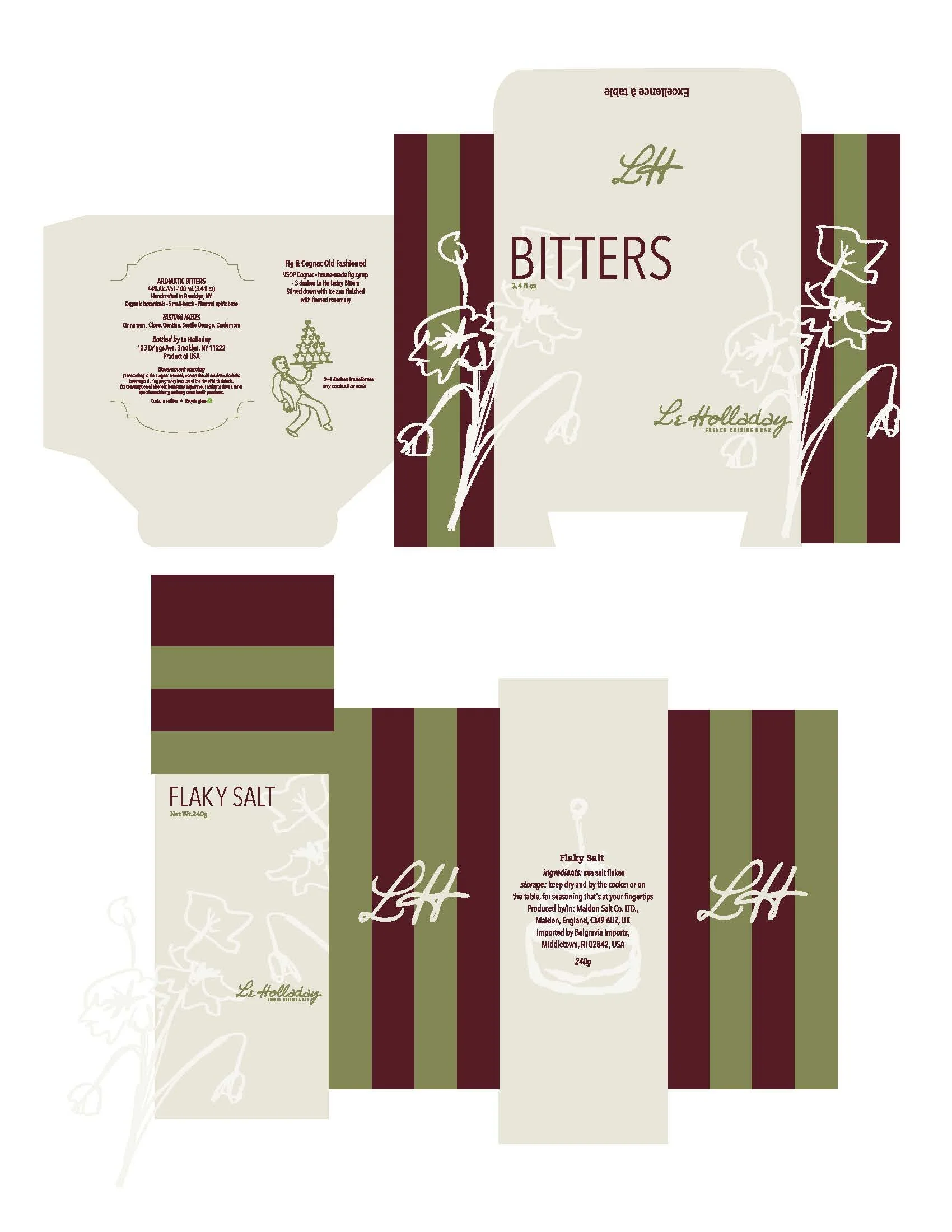
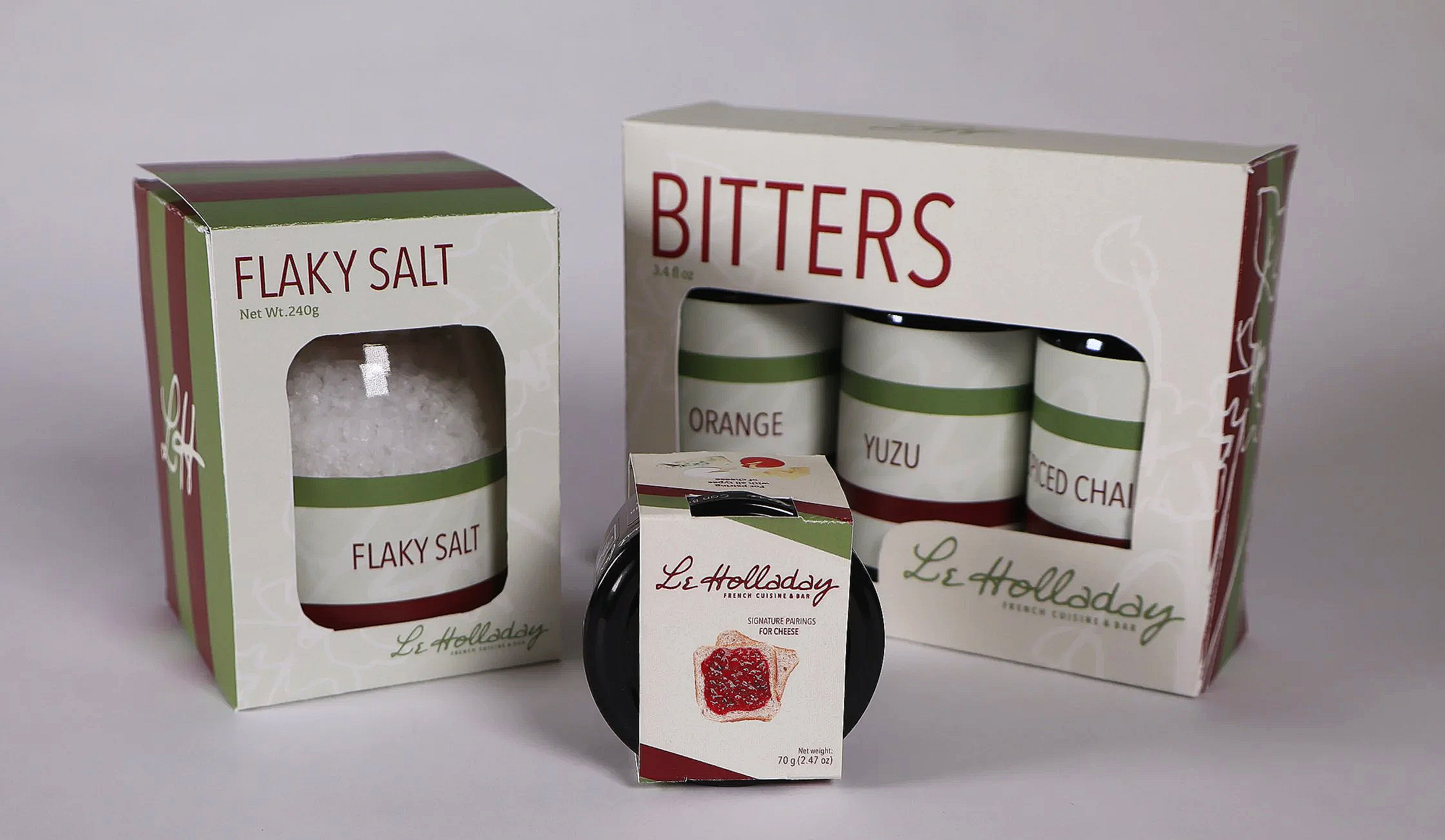
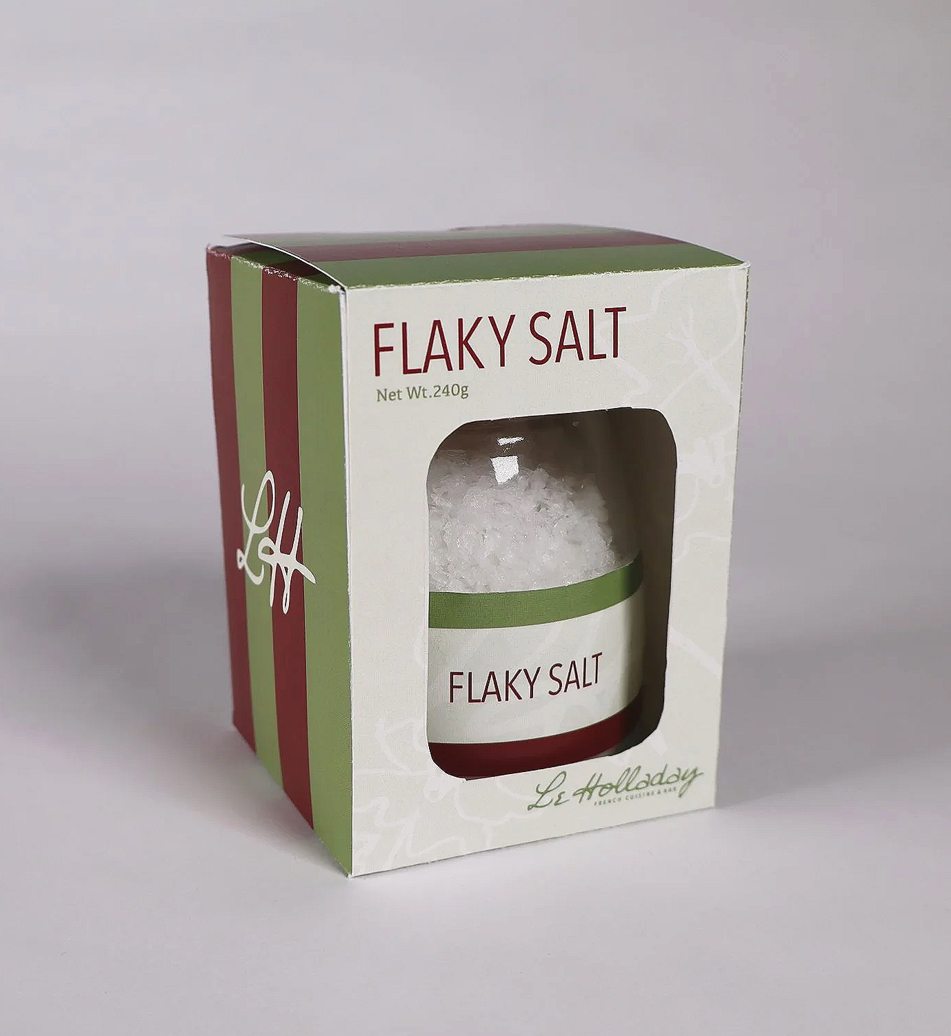
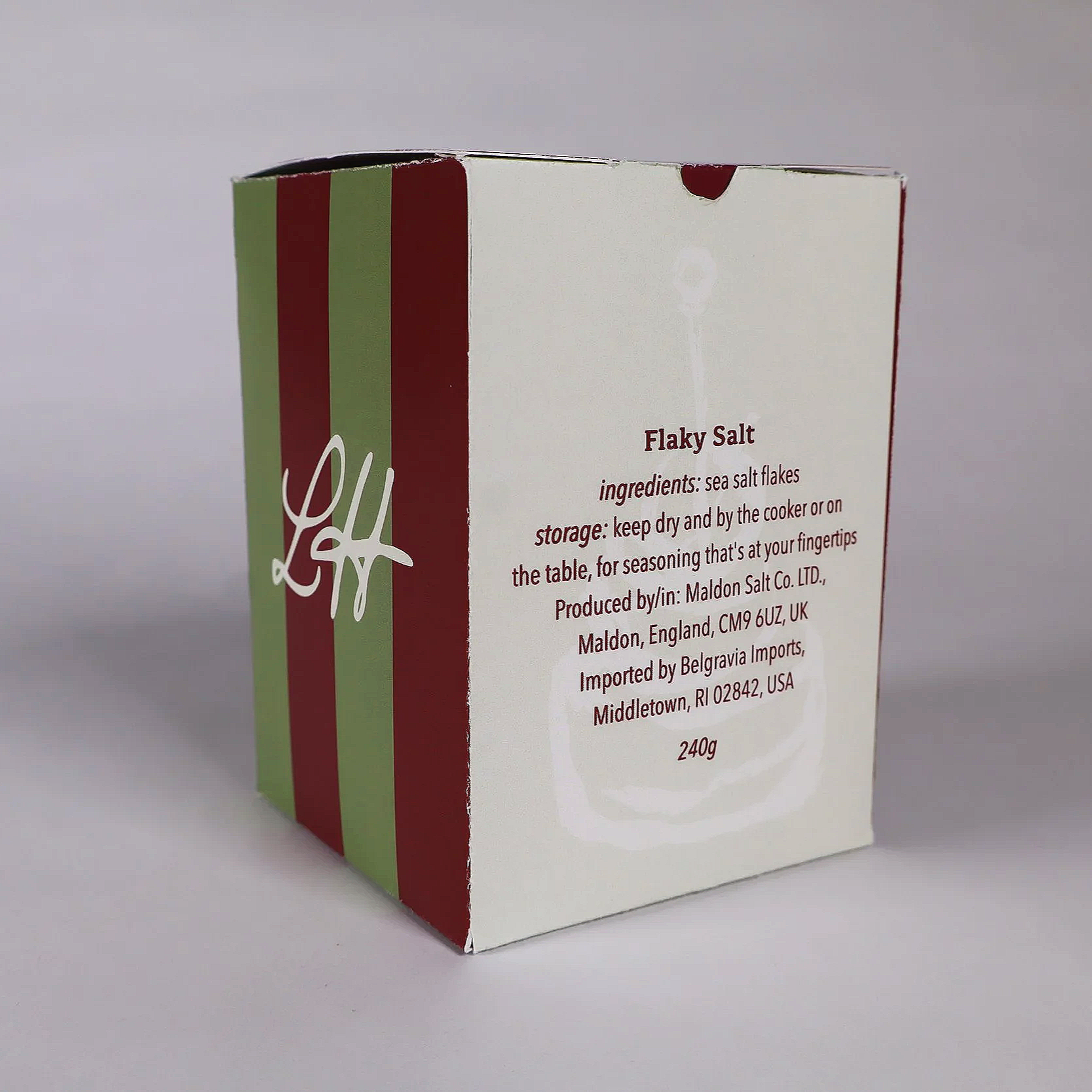
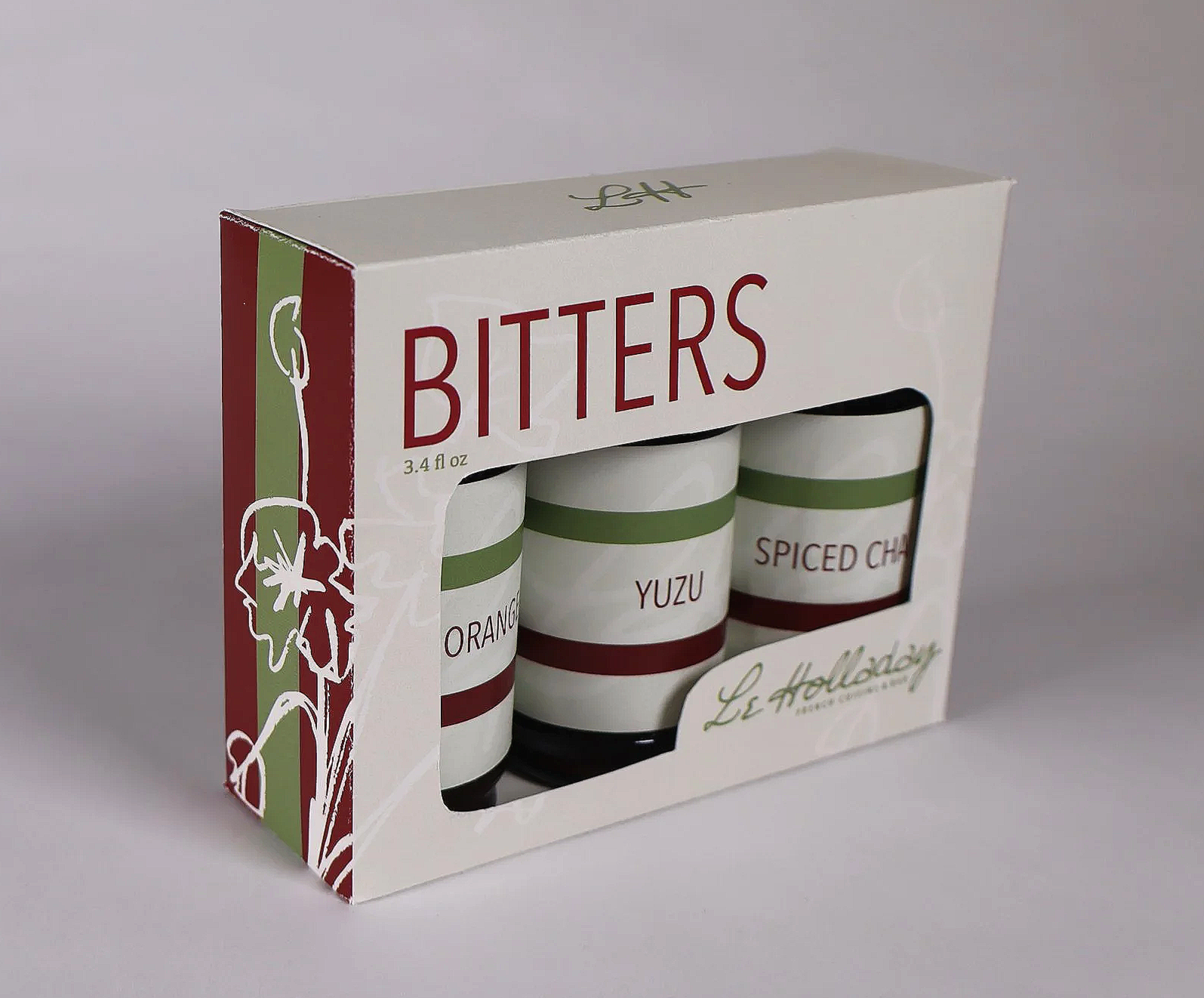
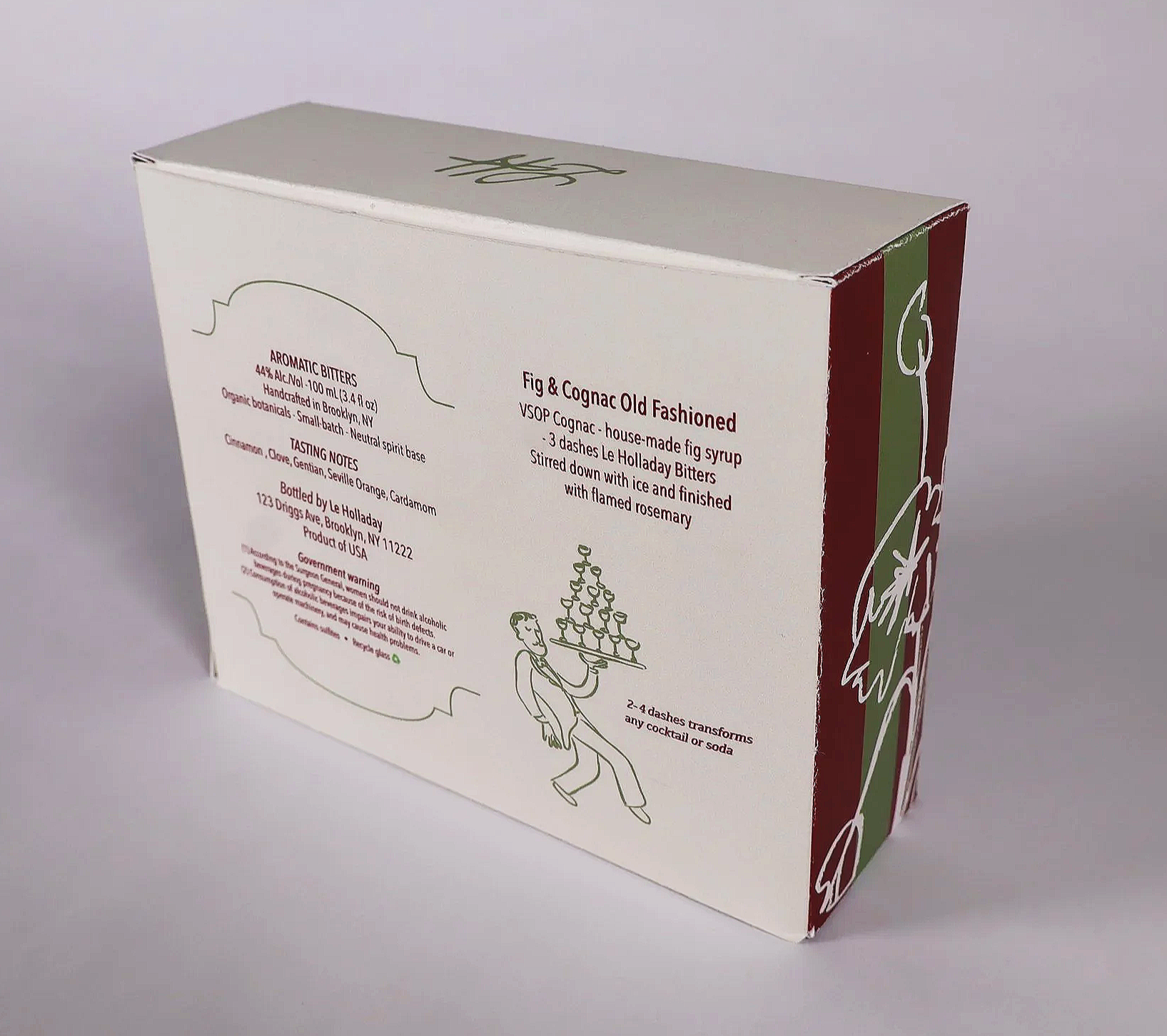
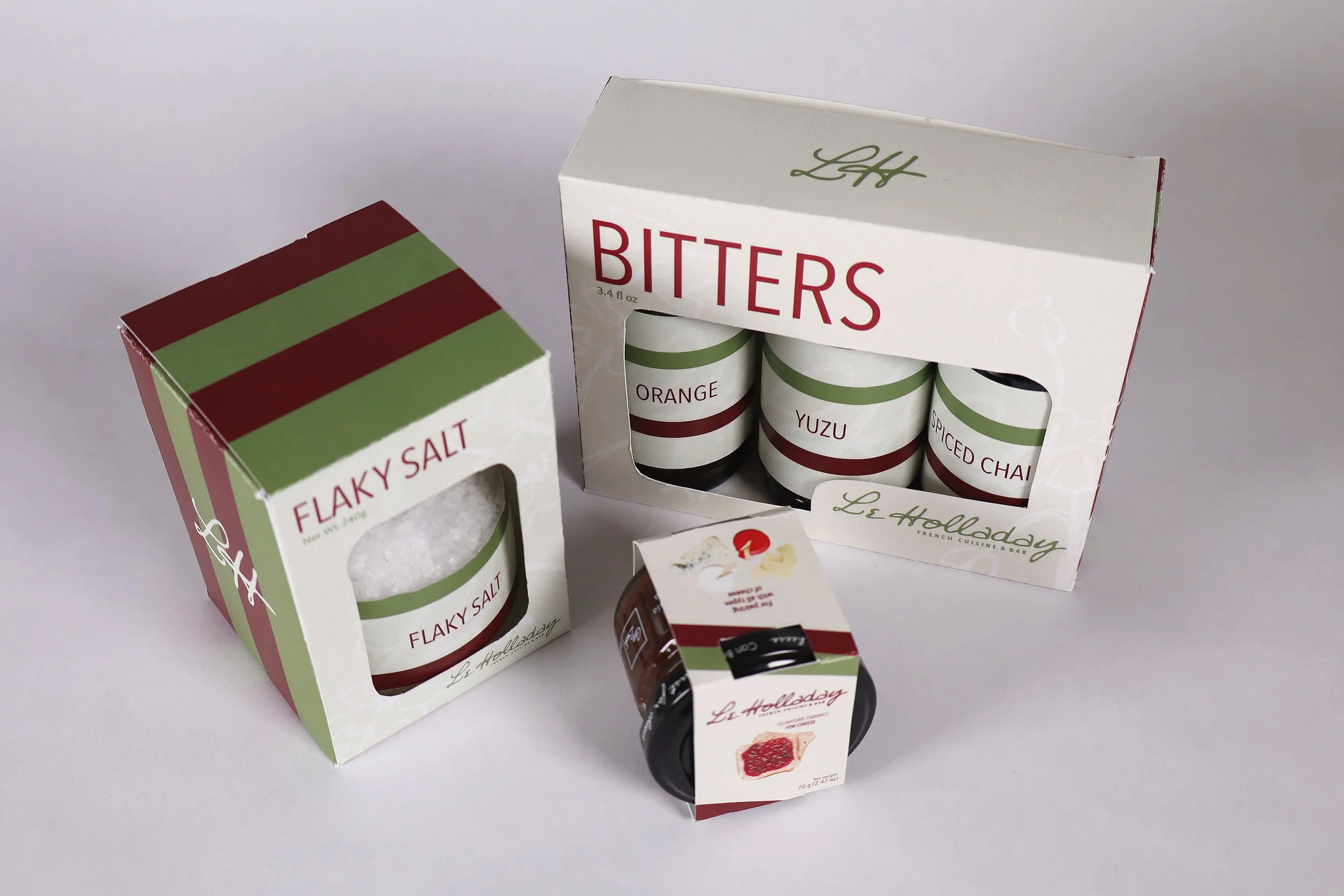
This project extended the Le Holladay brand identity — originally developed in a branding class — into a cohesive three-product retail packaging system. The constraint was clear: all three products needed to feel like they belonged together, could sit in a restaurant retail display as a unified family, and maintained the visual language of the original identity.
DELIVERABLES
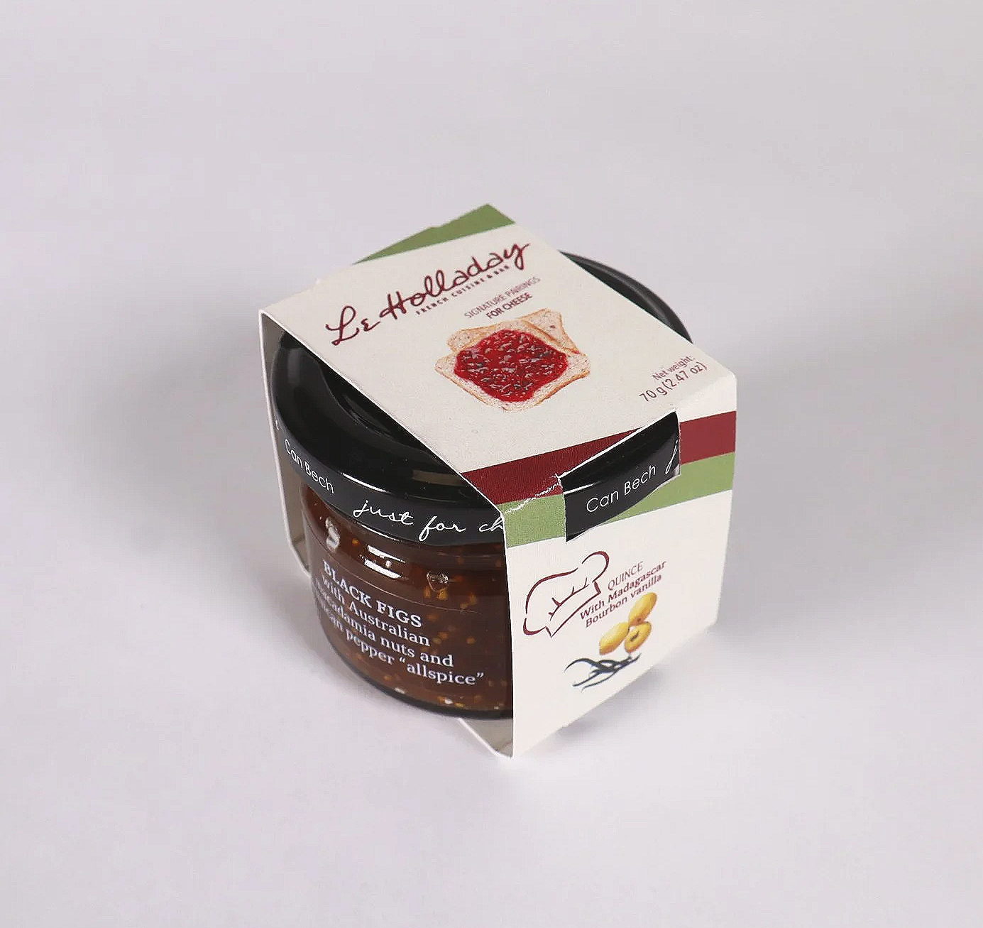
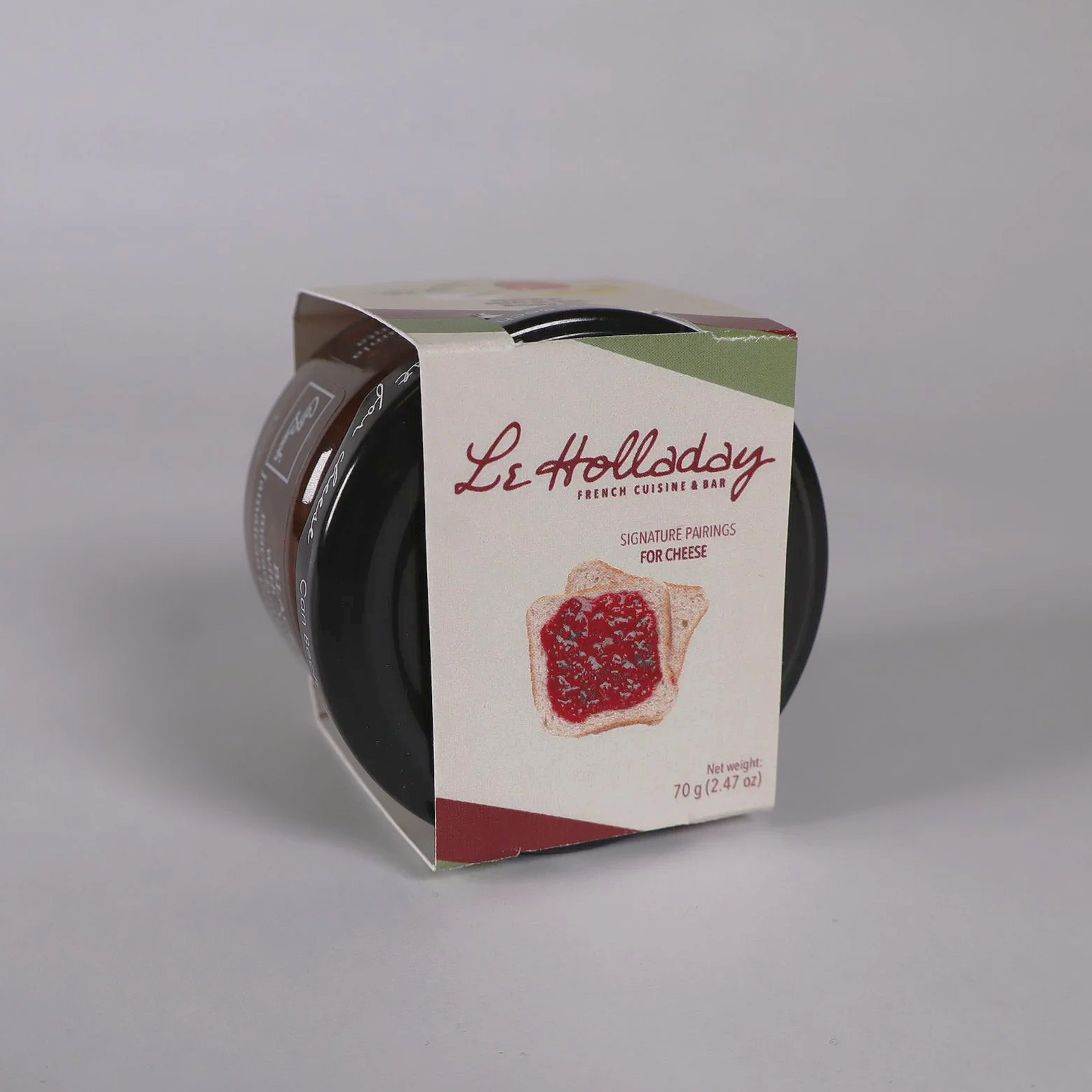
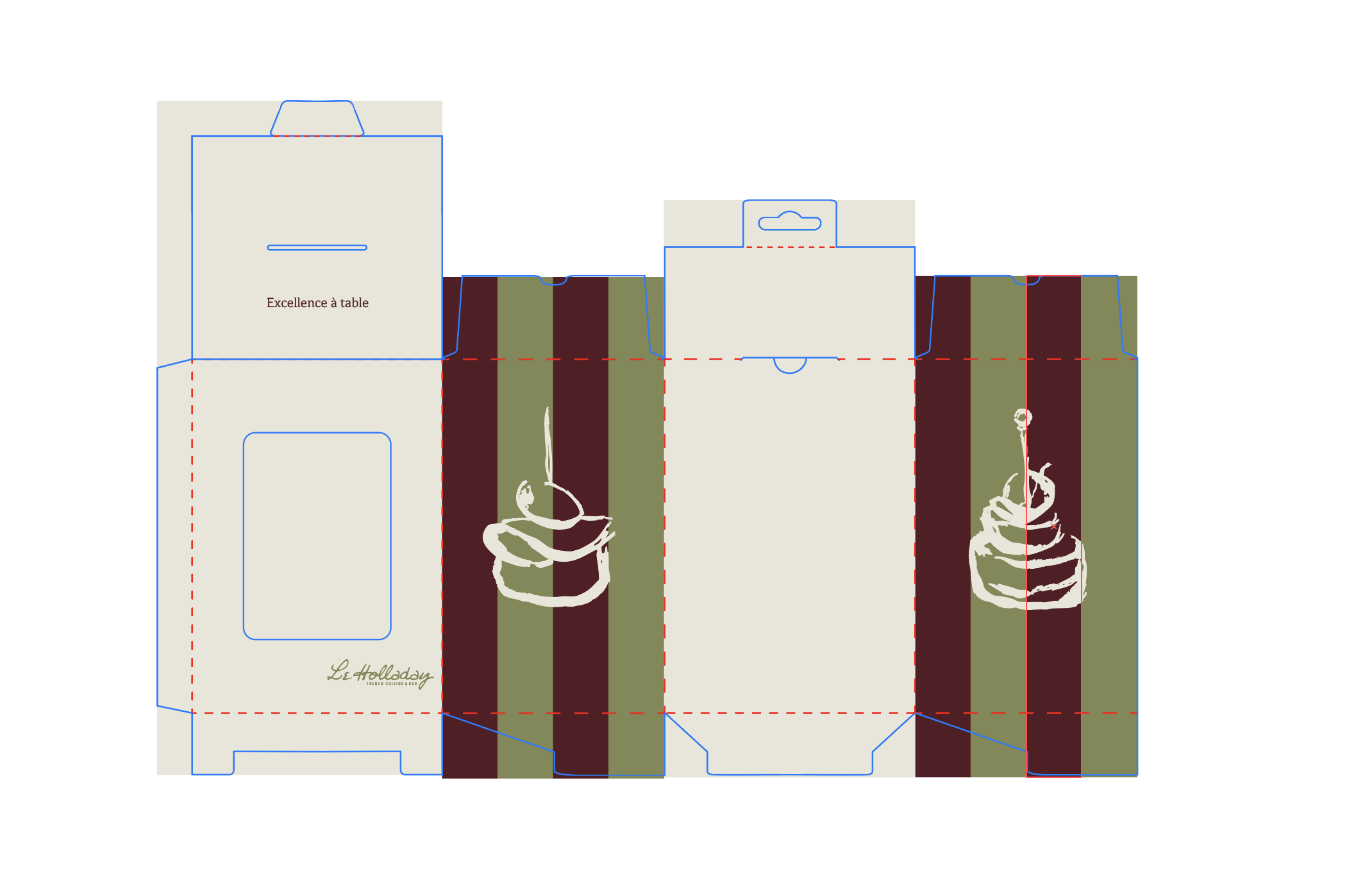
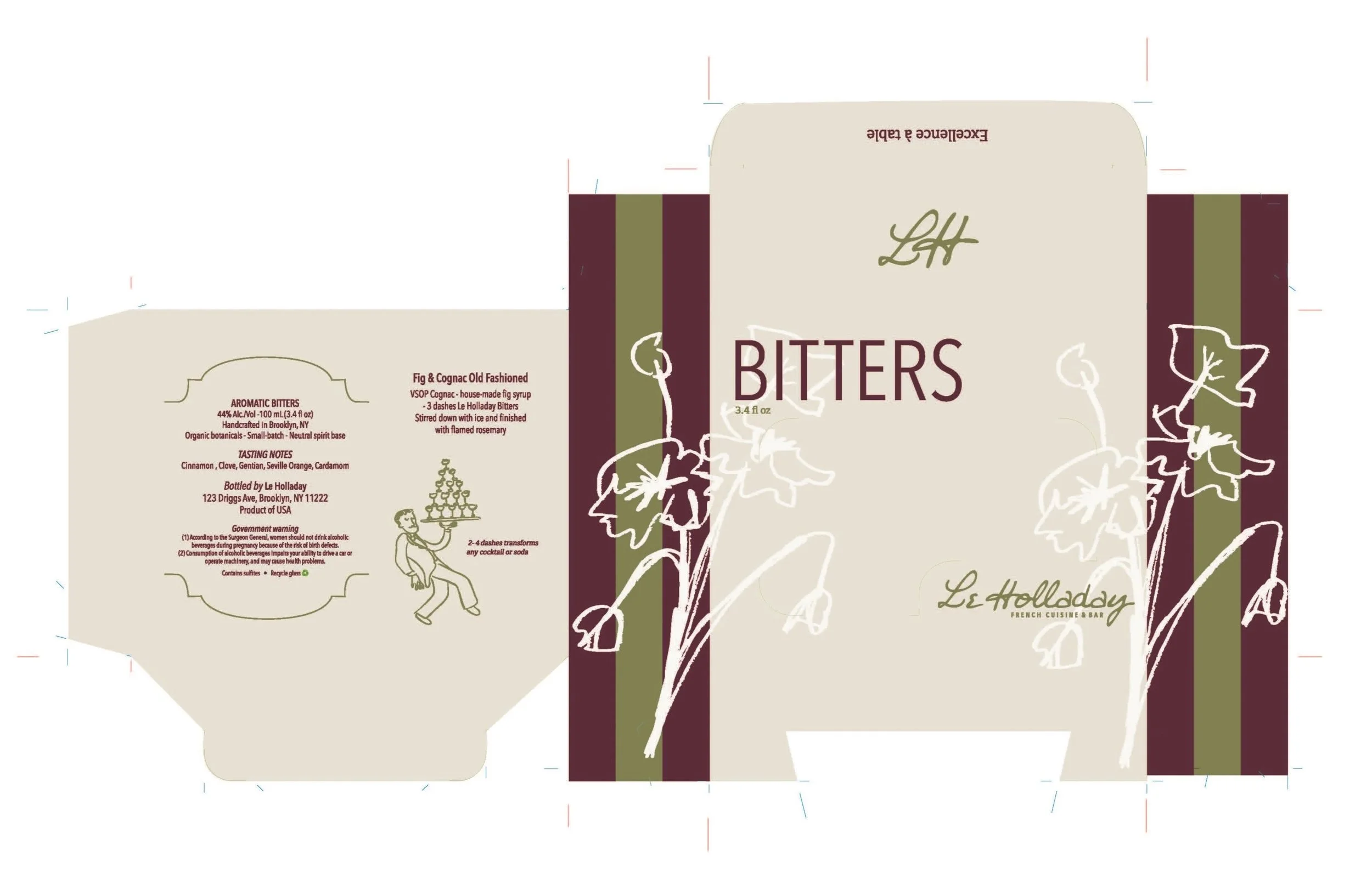
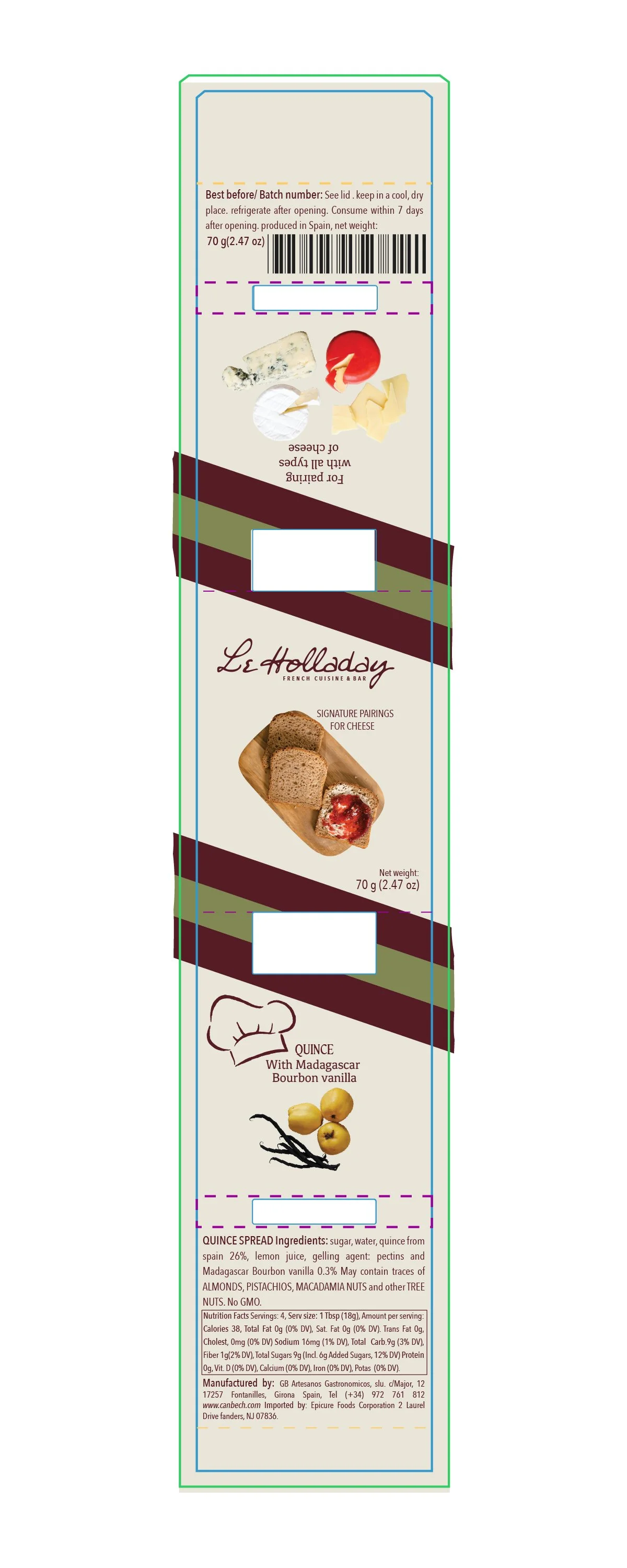
Retail packaging design for three products, including all label layouts, structural considerations, and mockups in display context.
THE CONCEPT
Designing for three products as a set meant thinking about how they'd look in relation to each other: same shelf, same brand, different containers. I had to find the visual thread that tied them together without making them feel identical. Typography and color did the linking; composition and hierarchy adapted to each form.
The physical packaging also introduced constraints that print and screen work don't have. Curved surfaces change how type reads. Label sizes are constrained by the container. These functional realities pushed my design thinking in ways that purely conceptual briefs don't.
KEY DESIGN DECISIONS
BRAND
All three products share the same color palette, typography, and design logic — immediately recognizable as a family.
LAYOUTS
Compositions adapted to each container's specific shape and label format rather than forcing a single layout across all three.
RETAIL CONTEXT
Designed to be read in proximity — three products on a shelf together should create a stronger visual impression than any single item alone.
BRAND CONTINUITY
The packaging extends the Le Holladay identity without diluting it — every choice can be traced back to the original system.