THE BREIF
This project involved designing a modern, professional logo for a logistics company — a full redesign built to replace an existing mark. The new identity needed to communicate reliability and forward momentum without falling back on the clichéd trucking imagery that fills the industry.
DELIVERABLES
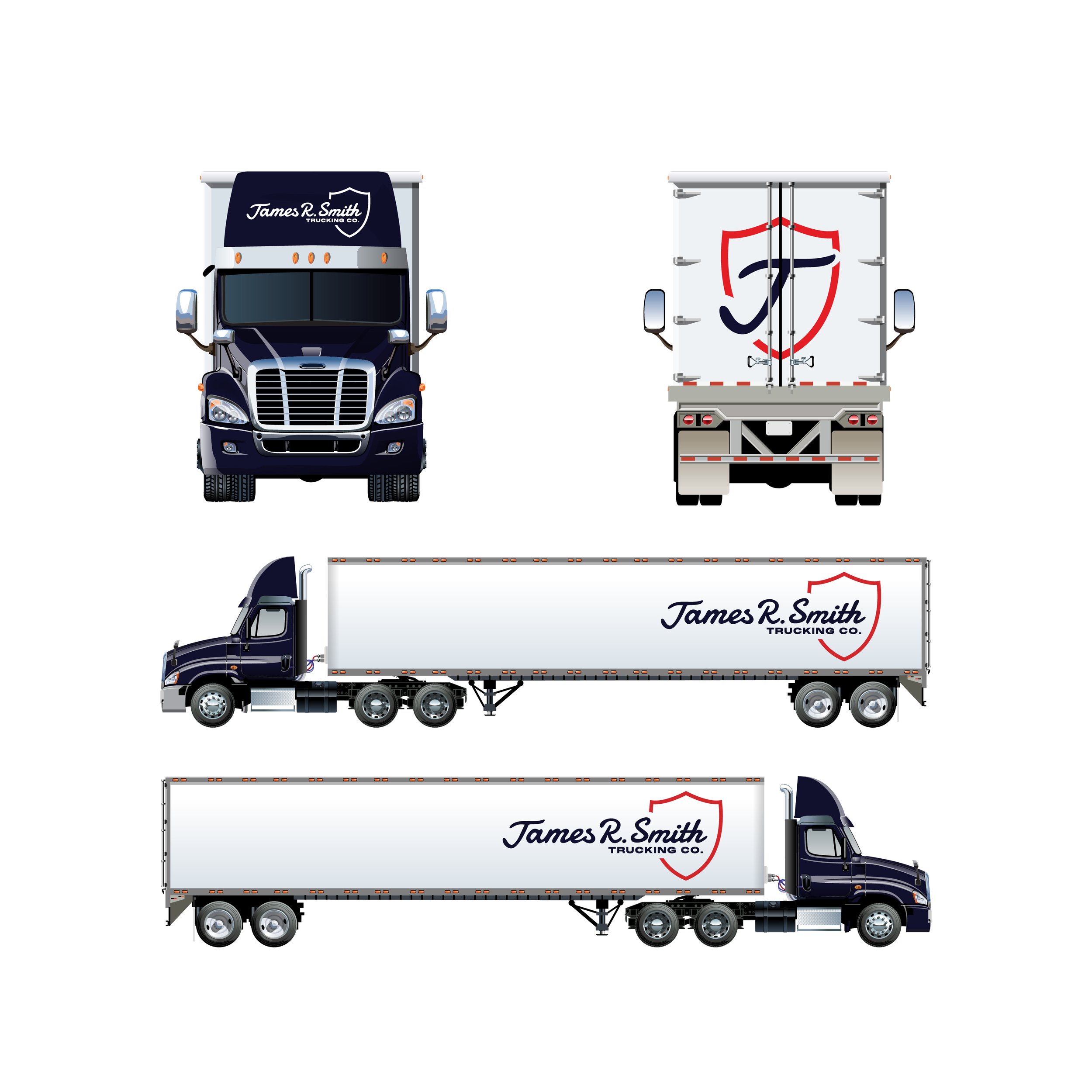
Primary combo mark logo, alternate symbol-only version, mockups across vehicle, business card, and digital applications
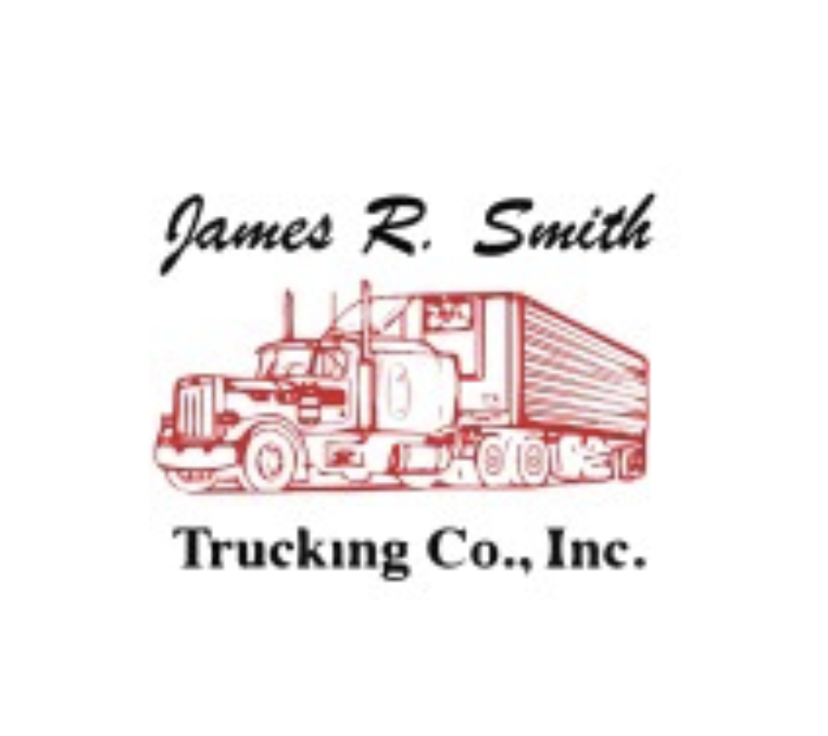
Original Logo
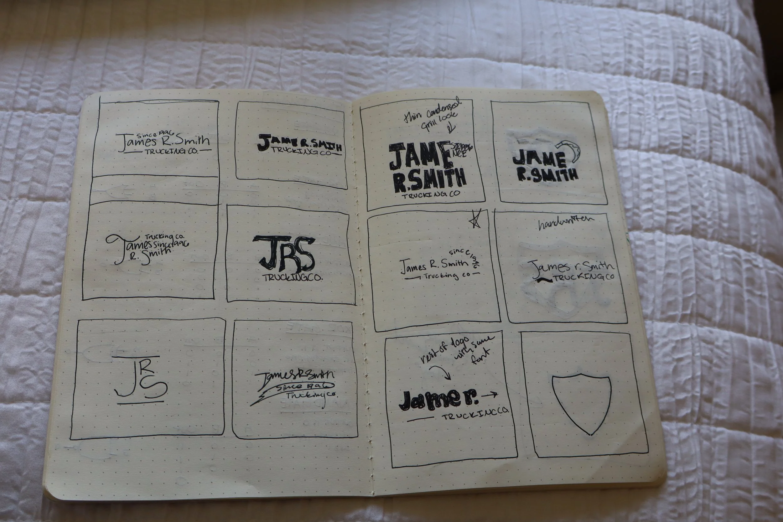
THE CONCEPT
Logos for logistics companies carry a specific burden: they live at high speed. A mark that looks great in a portfolio doesn't matter if it reads as a blur at 70 miles per hour or loses its shape when scaled down to a business card. That constraint shaped every decision I made.
The combo mark approach — a symbol paired with a wordmark — gave the identity flexibility. The symbol can stand alone on a truck door; the full lock-up works for stationery and digital. I wanted something that felt confident and modern without trying too hard to be clever.
The goal was restraint. Logistics is a trust business. The design needed to communicate that this is a company that shows up, delivers, and doesn't overcomplicate things. Clean geometry, strong legibility, and a palette that reads as professional from the road.
KEY DESIGN DECISIONS
LEGIBILITY AT SPEED
Every element was tested for readability on vehicle surfaces viewed in motion — the core challenge of truck branding.
COMBO MARK FLEXIBILITY
Symbol plus wordmark allows the identity to adapt across scales from door panels to invoice headers.
COLOR
Color choices signal reliability and professionalism — deliberate rejection of flashy or trend-driven aesthetics.
SCALABILITY
The mark was designed to work from small embroidery to full trailer wraps without losing its integrity.