THE BREIF
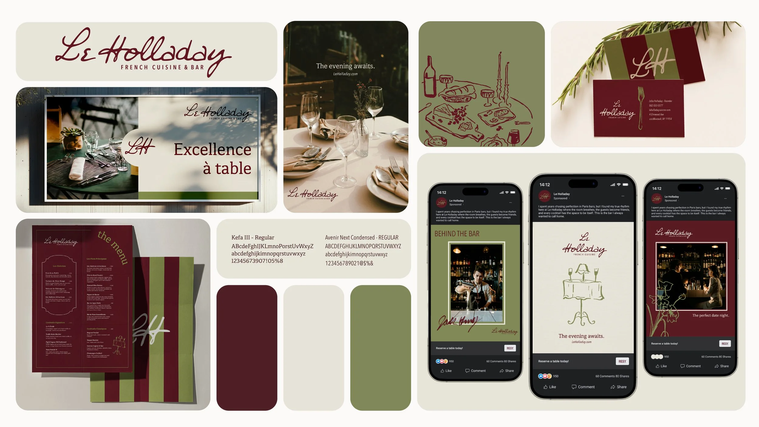
This academic branding project challenged me to develop a complete visual identity for a service industry business of my own invention. I created Le Holladay — a French cuisine restaurant and bar concept — and built out a full identity system from logo to menus to signage, with the additional constraint of incorporating my own last name into the brand.
DELIVERABLES
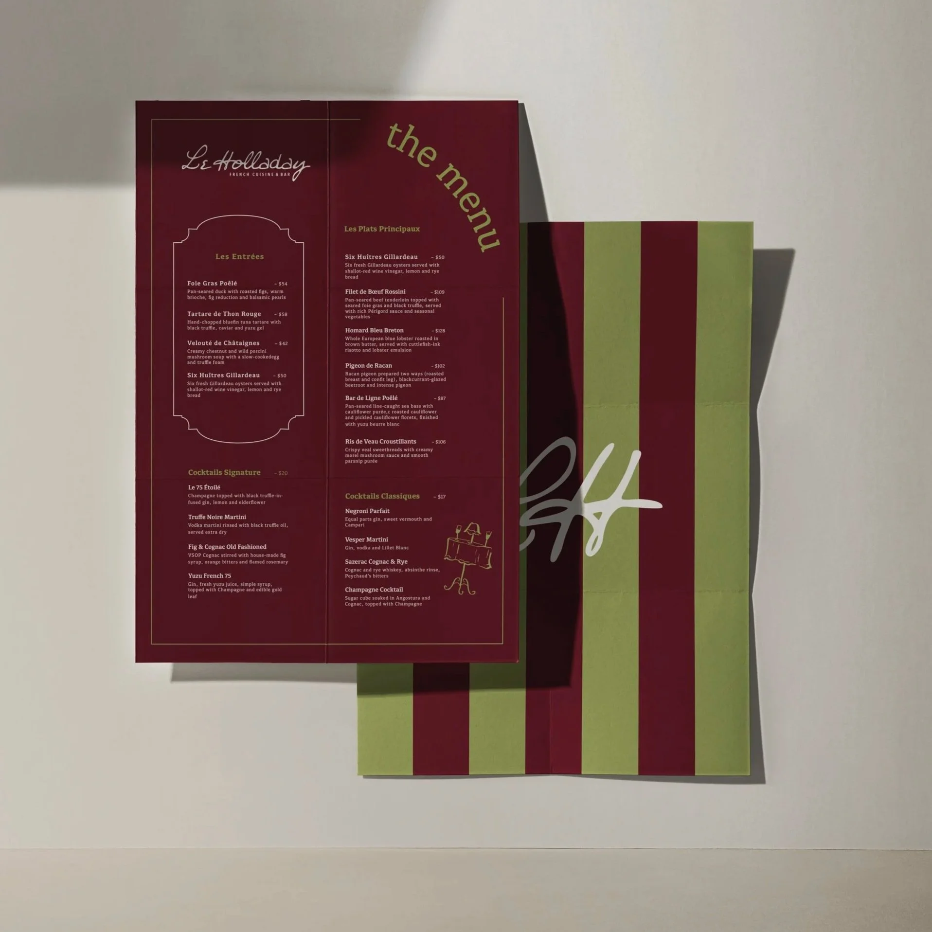
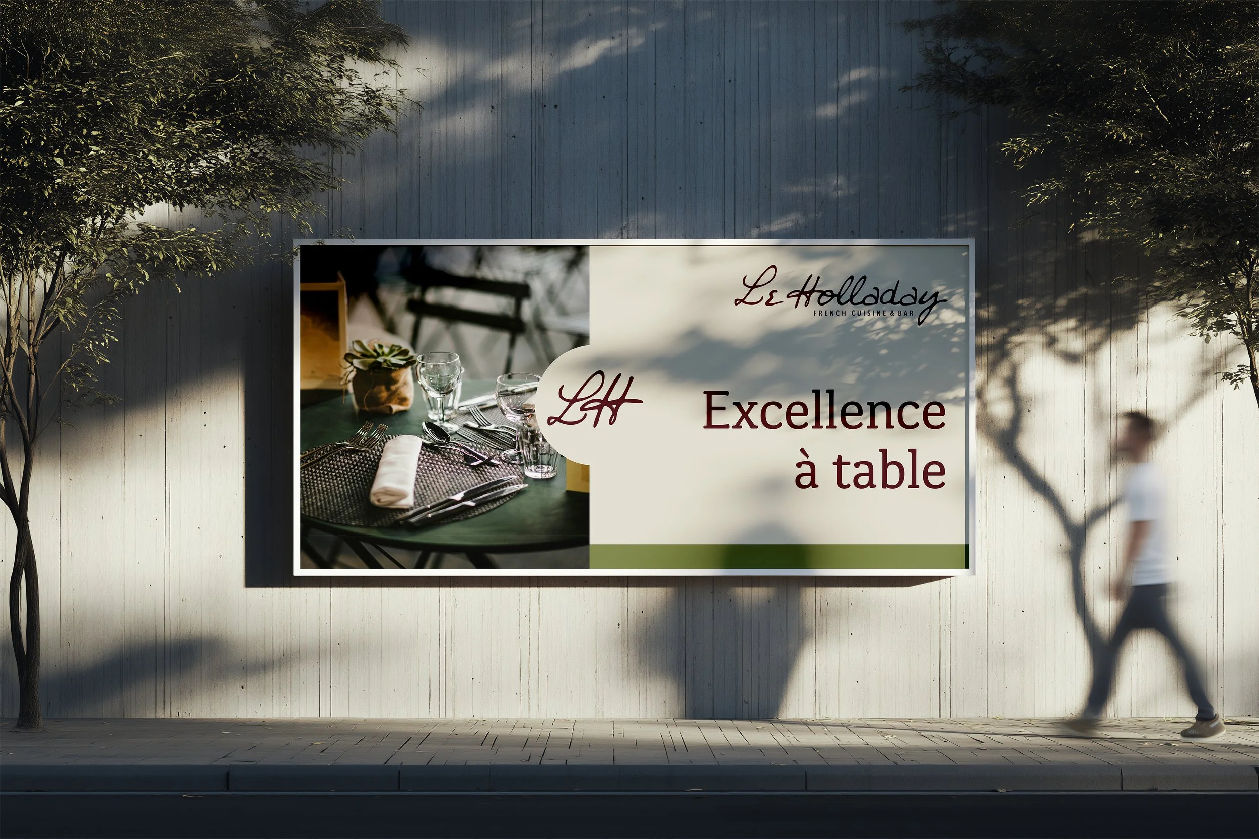
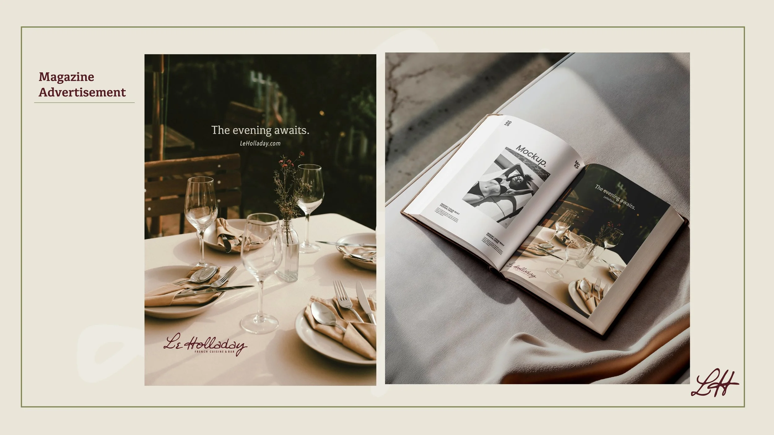
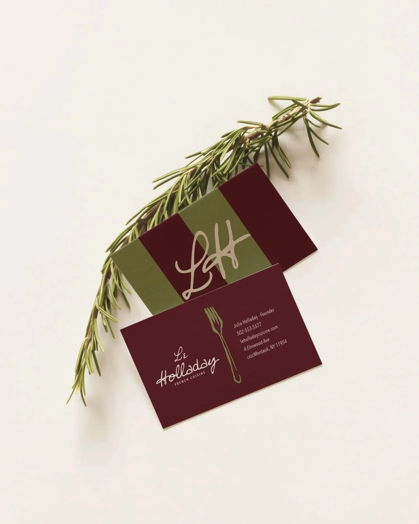
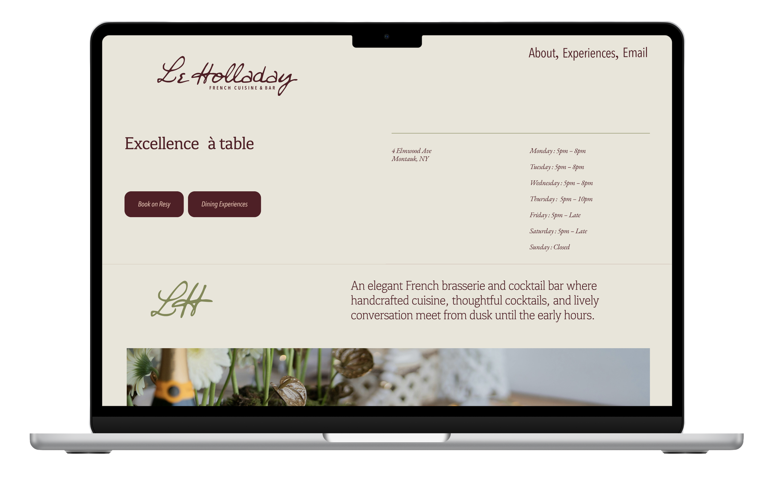
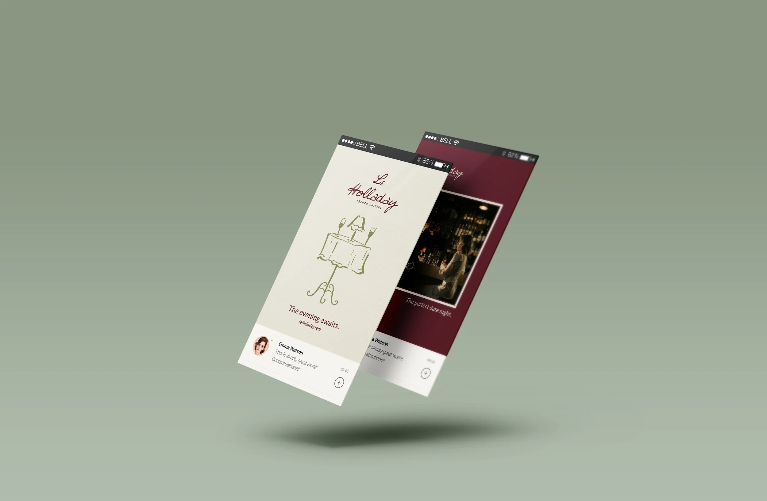
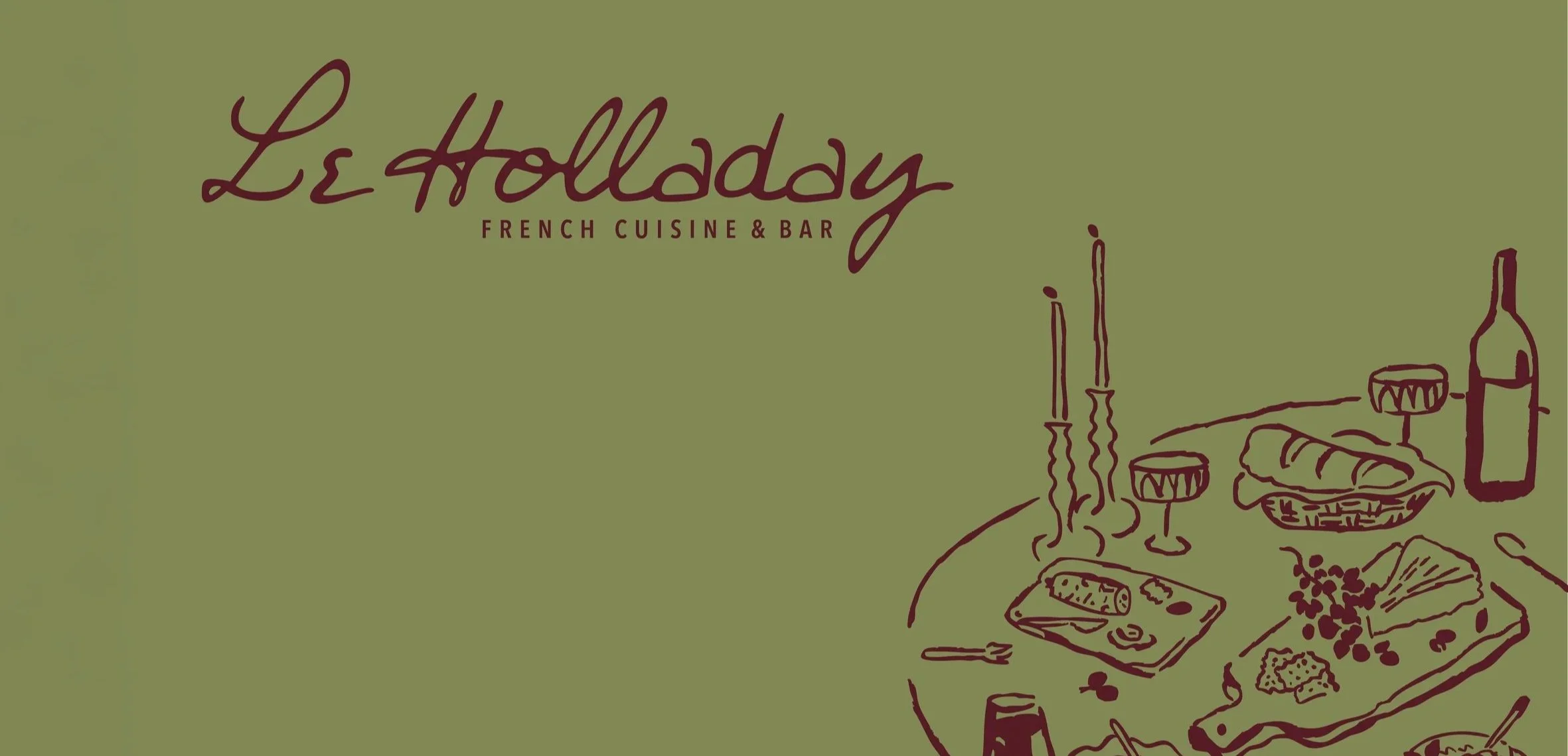
Logo suite, brand color and typography specifications, menu design, business cards, billboard mockup, and signage applications
THE CONCEPT
The brief asked for a restaurant brand, and my instinct was to go somewhere elegant — but elegance that feels earned, not borrowed. I wanted Le Holladay to feel like a place you'd actually want to spend an evening: warm, refined, and a little intimate.
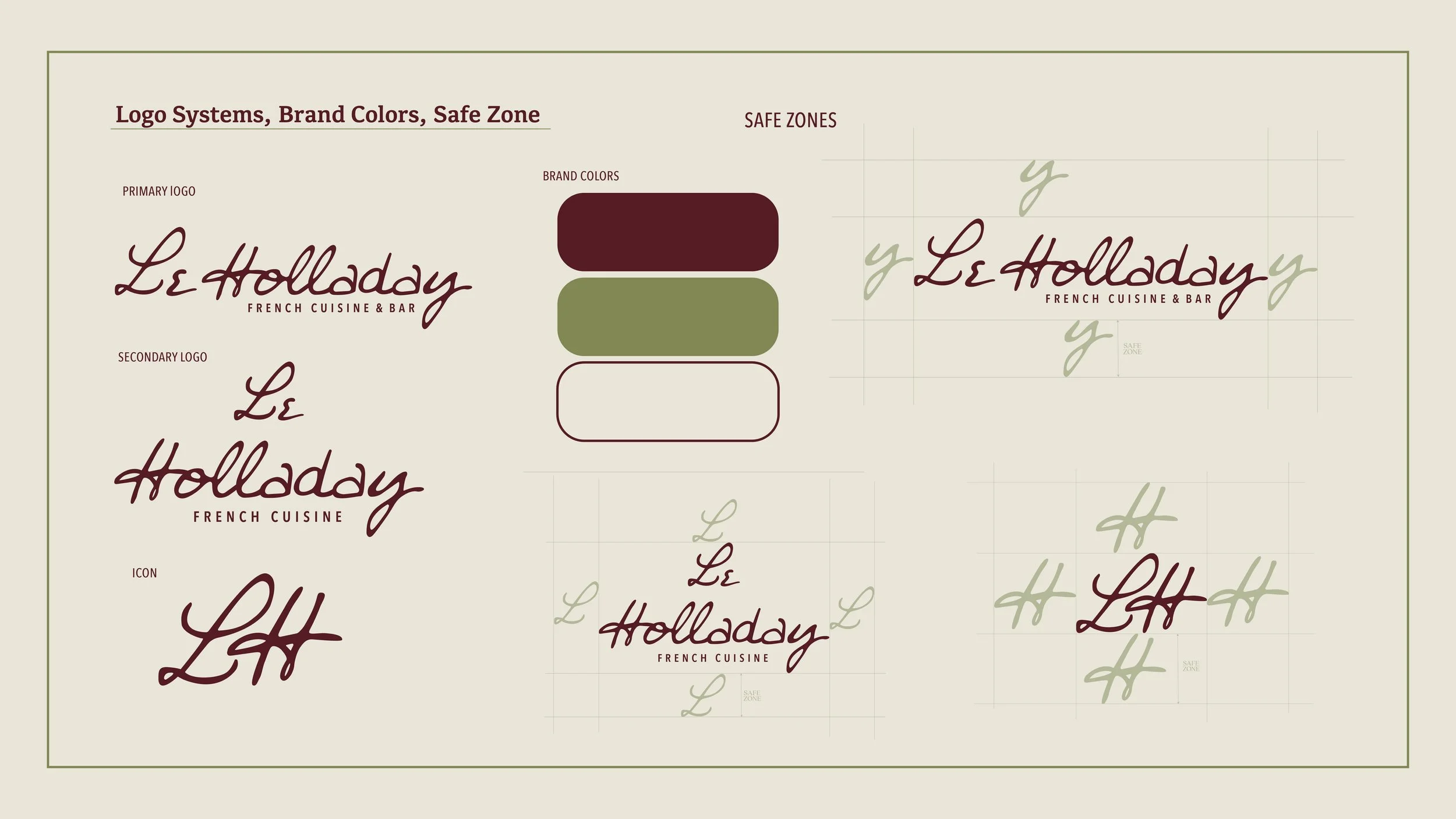
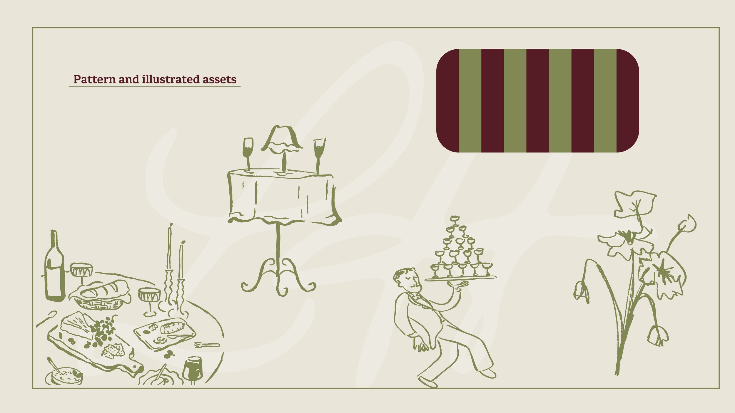
Working with a three-color palette was one of the most useful constraints I've had. It forced every choice to matter. The typography was selected to carry most of the visual personality — I needed typefaces that could communicate the warmth of French dining culture without leaning on clichés. The logo had to work at every scale from a dinner menu to a billboard, which shaped how I approached the mark's geometry.
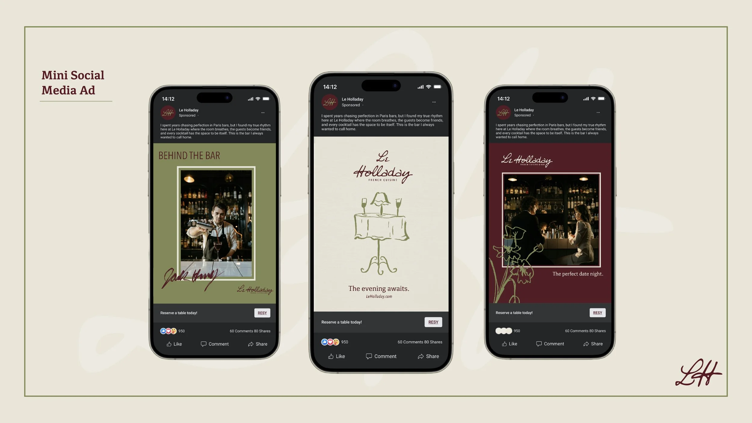
Extending the identity beyond a single logo — into menus, signage, business cards, and web — is where the system thinking kicked in. Every application had to feel like it came from the same place, even when the context changed completely.
KEY DESIGN DECISIONS
THREE COLOR CONSTRAINT
A self-imposed limit that forced intentionality into every design choice across all applications.
TYPOGRAPHY
Type selection carried the elegance and warmth of French dining culture — letting the letterforms do the heavy lifting.
SCALABILITY
Every mark and layout was stress-tested across scales, from wallet-sized cards to full billboard mockups.
SYSTEM CONSISTENCY
Each touchpoint was designed in relation to the others, so the brand reads as one unified experience.