This project challenged me to invent a beverage brand from scratch —defining a beer style, and designing both the bottle label and multi-unit carrier packaging. The emphasis was placed squarely on the labeling and packaging design itself, not just the branding concept.
THE BREIF
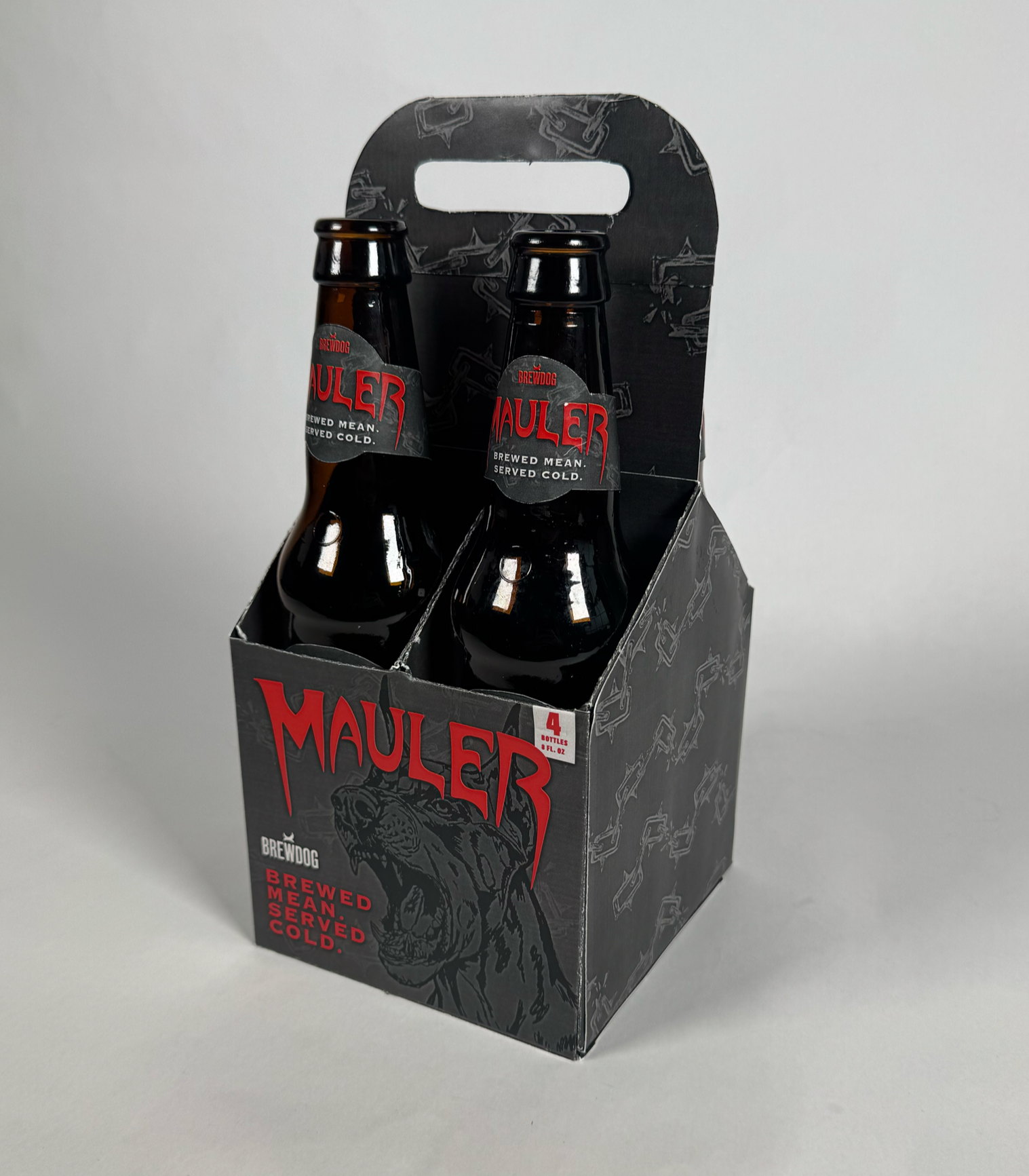
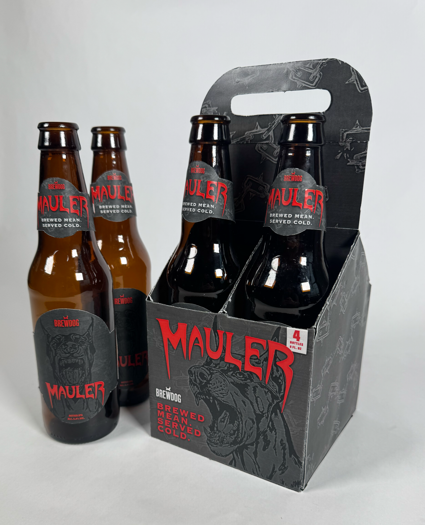
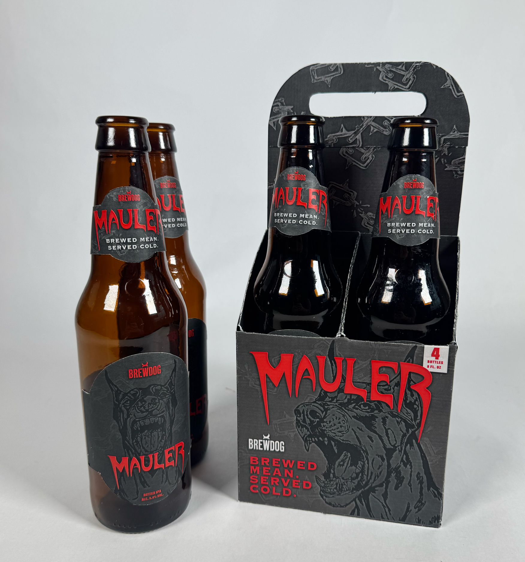
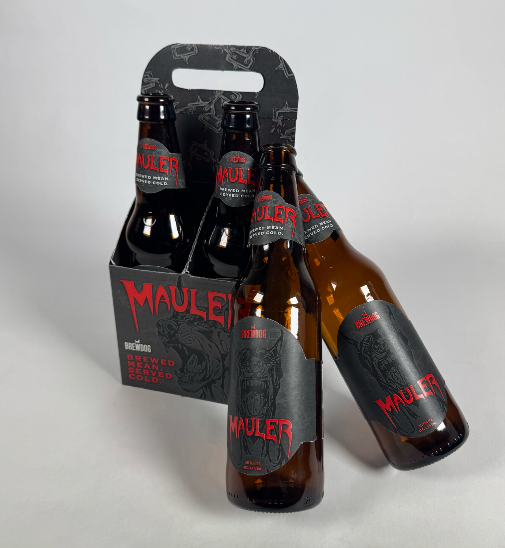
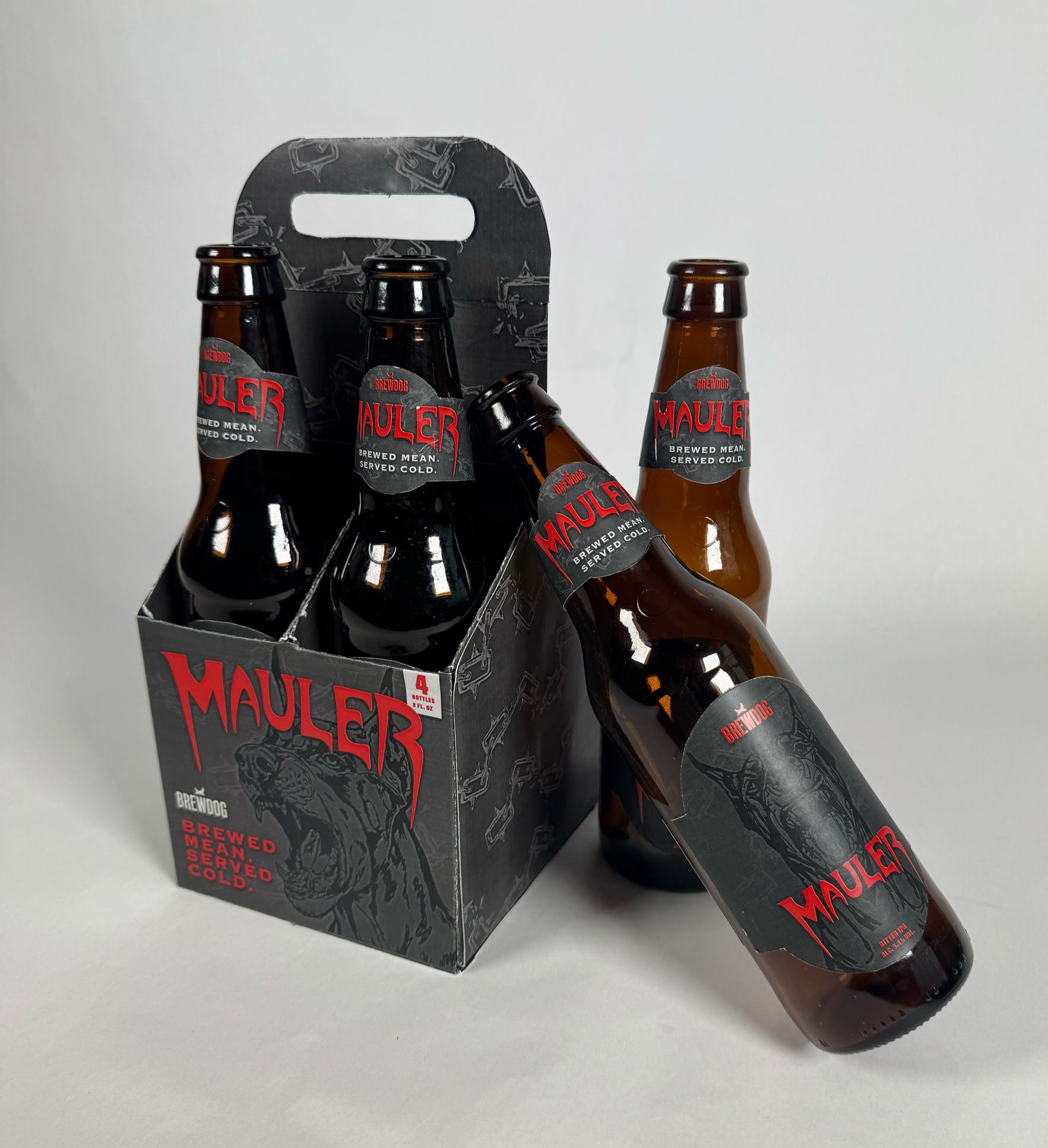
I created Mauler, a Bitter IPA brewed under the BrewDog name, built around the visual language of heavy grunge and hard rock culture. The brand's mascot — a snarling doberman rendered in a gritty, high-contrast illustration style — became the anchor of the entire visual system. Every design decision was made in service of one feeling: raw, uncompromising aggression you can hold in your hand.
DELIVERABLES
I wanted the packaging to feel like it had been pulled straight off a concert poster — something that could hang on a wall or sit in a record crate and look completely at home. The idea started with the name: Mauler. From there, everything followed naturally. A snarling doberman as the mascot. A drip-style heavy metal wordmark. A palette of blood red and deep charcoal that leaves no room for softness.
THE CONCEPT
COLOR
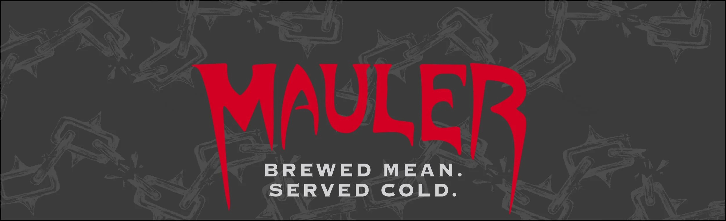
Blood red on deep charcoal — maximum contrast, zero softness. The palette does the aggression before the copy does.
KEY DESIGN DECISIONS
TYPOGRAPHY
A custom horror-drip word-mark for the brand name, paired with stacked all-caps slab type for the tagline.
ILLUSTRATION
Heavy grunge line-work. The doberman always shows teeth — this illustration style never softens, never decorates, it snarls.
SYSTEM THINKING
Label and carrier were designed as one cohesive system.