THE BREIF
During a design internship, I collaborated with a senior designer to refresh the brand identity for Sam's Fans — a nonprofit founded in memory of Samantha Jane McCarthy, who lived with Fanconi Anemia, a rare genetic blood disorder. The organization needed a visual identity that could carry the weight of its mission while still feeling warm, hopeful, and human.
DELIVERABLES
Logo suite with multiple variations, color palette and typography specifications, original brand illustrations, and social media asset templates.
THE CONCEPT
The hardest part of this project wasn't the design itself — it was understanding what the design needed to hold. Sam's Fans isn't a product or a service. It's a community built around grief, love, and resilience. Every visual decision had to honor that without feeling heavy.
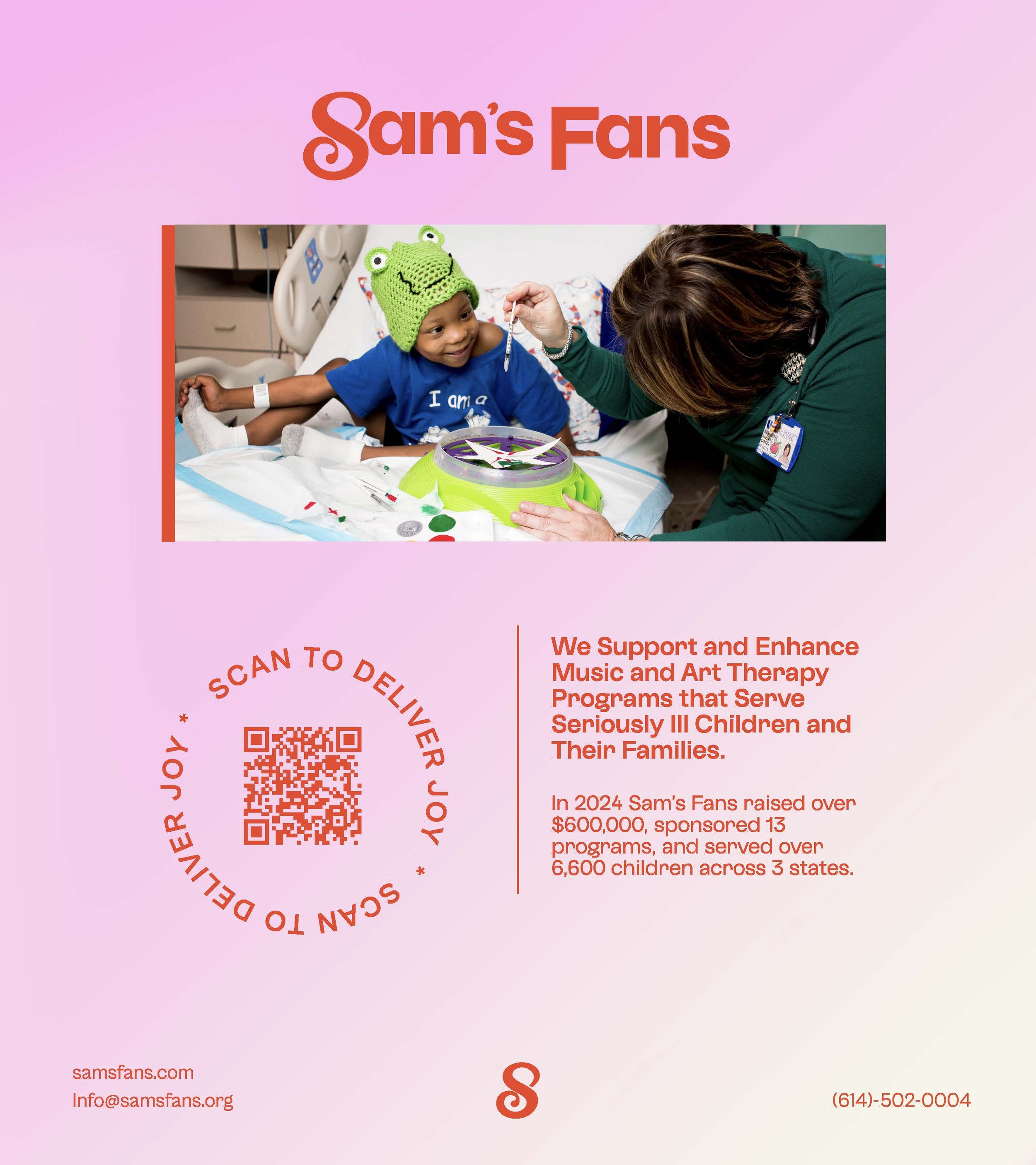
Working alongside a senior designer taught me as much about process as it did about craft. We went through multiple logo iterations, testing how far we could push the color palette toward hope and warmth before it stopped feeling grounded in the organization's real story. The illustrations I developed were meant to carry Sam's spirit — joyful and full of life — while still feeling purposeful enough for a professional nonprofit context.
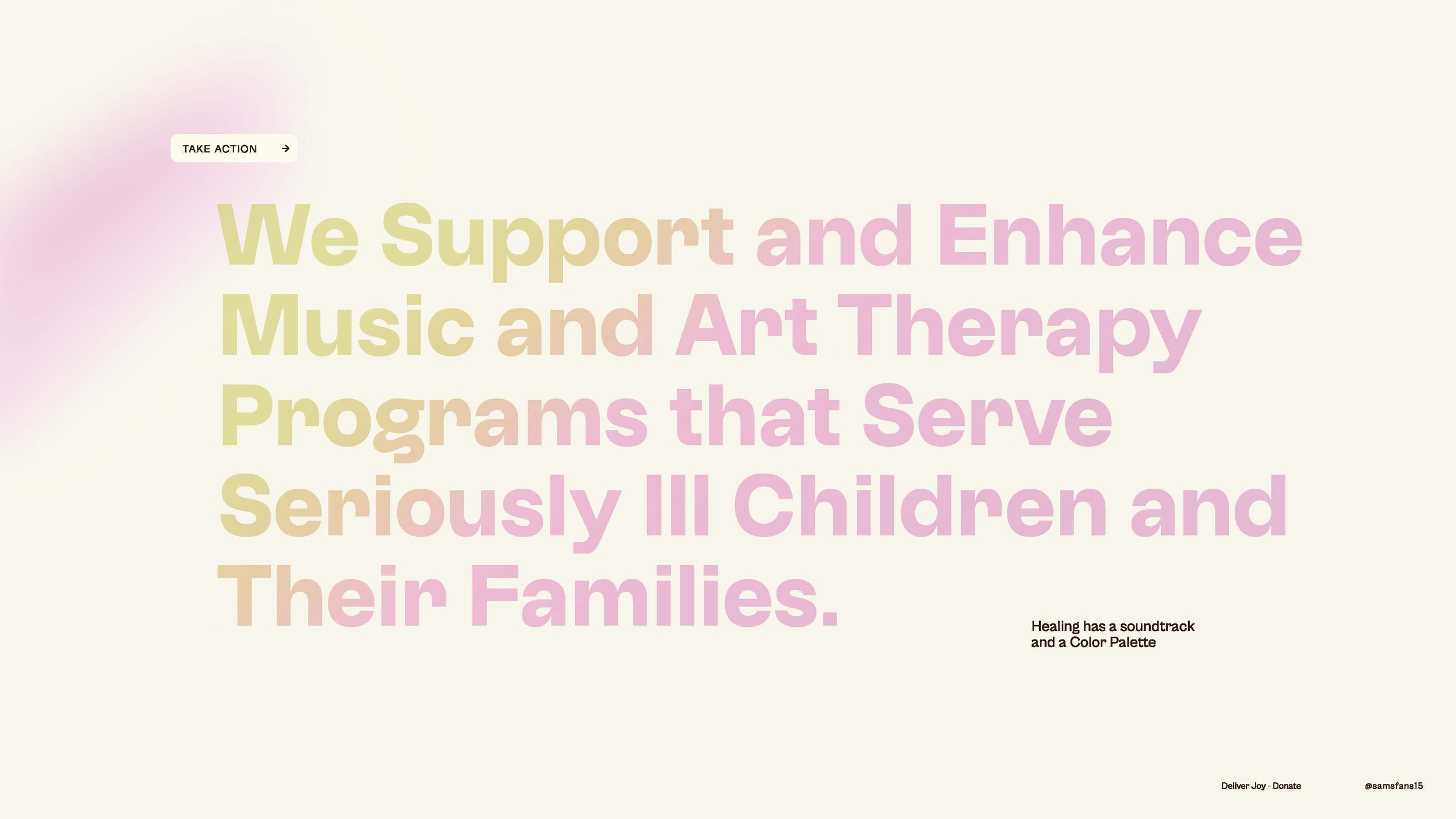
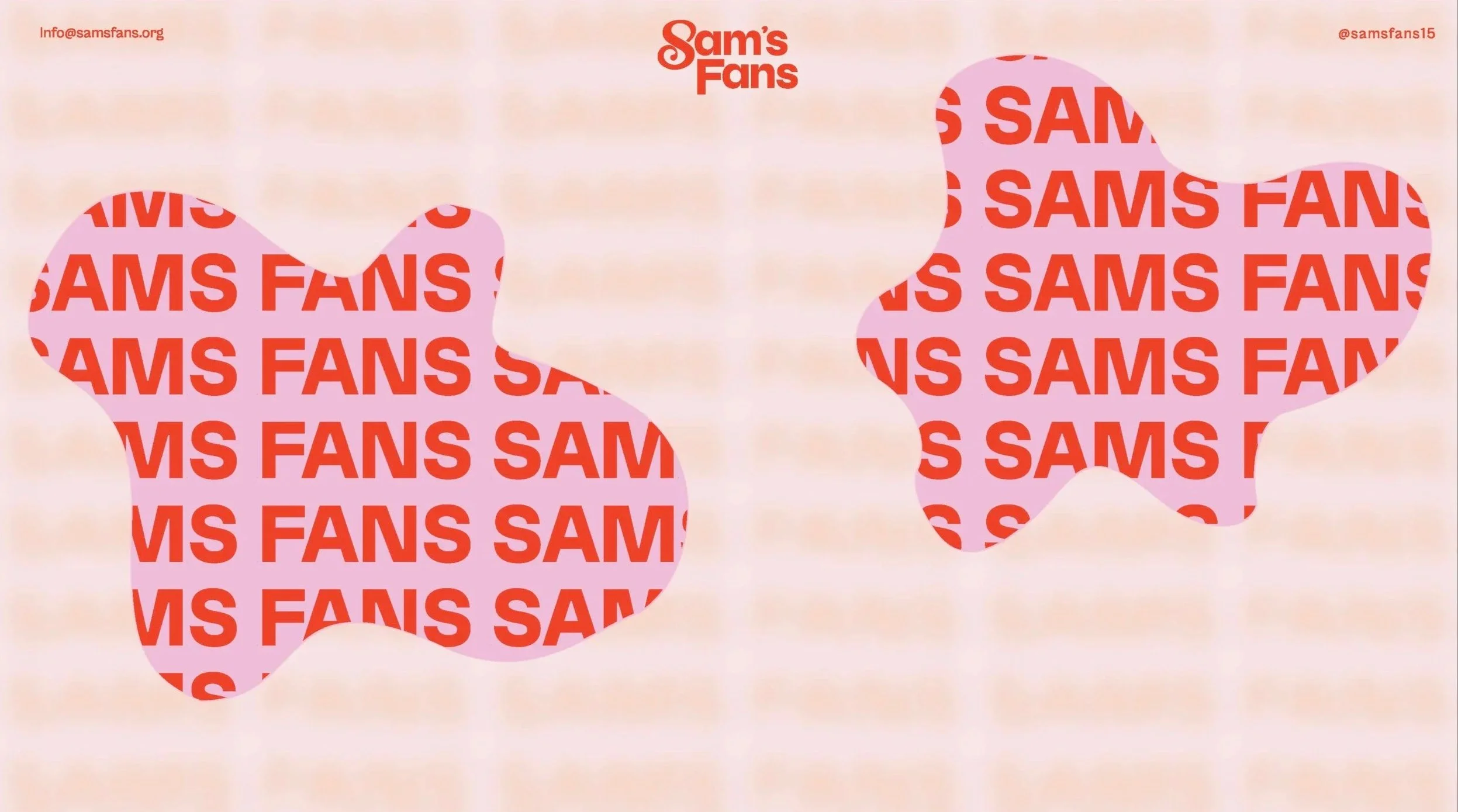
The social media assets extended that identity into the digital space, giving the organization a consistent voice across platforms that matched how the community actually experienced the brand.
KEY DESIGN DECISIONS
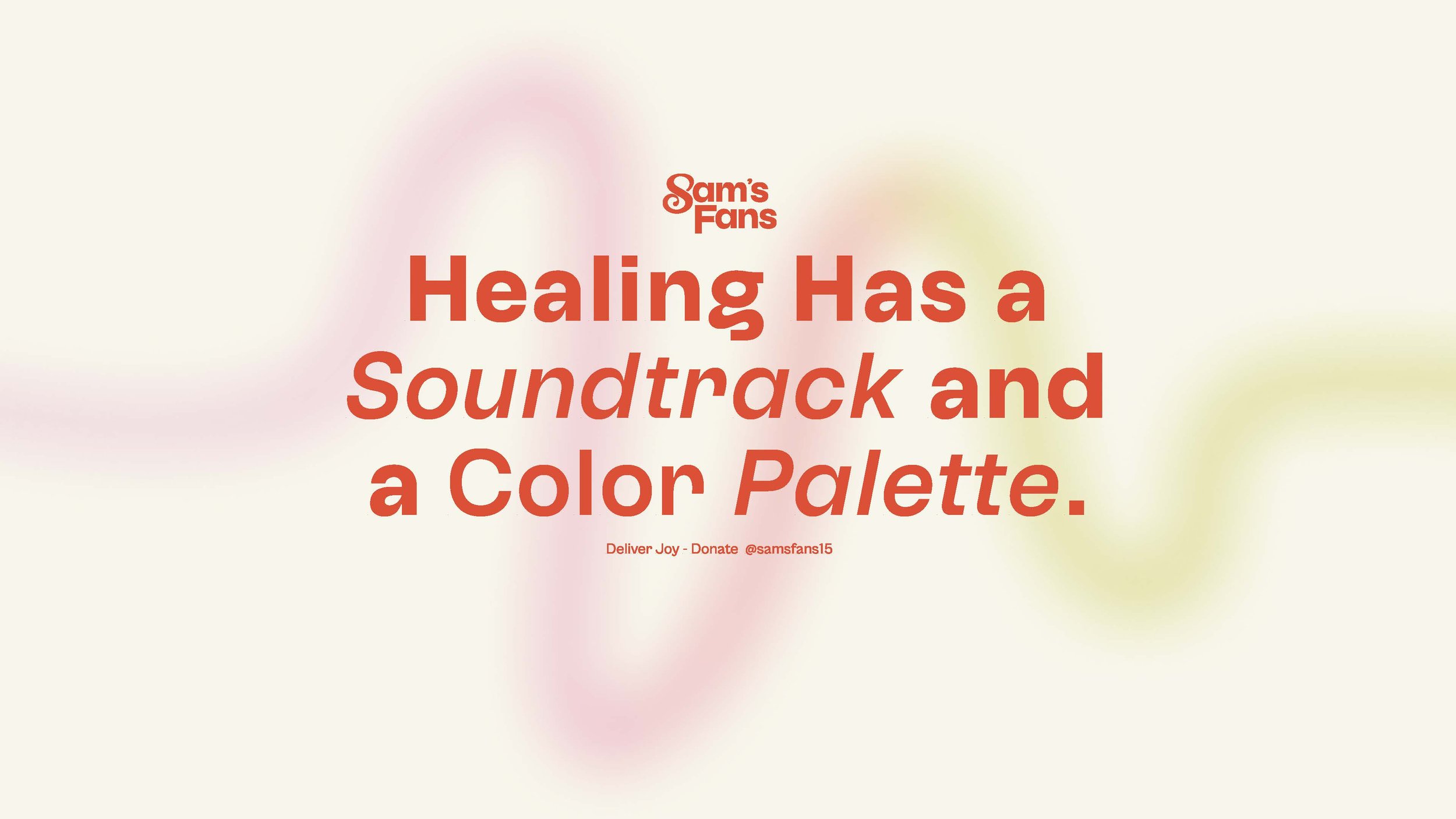
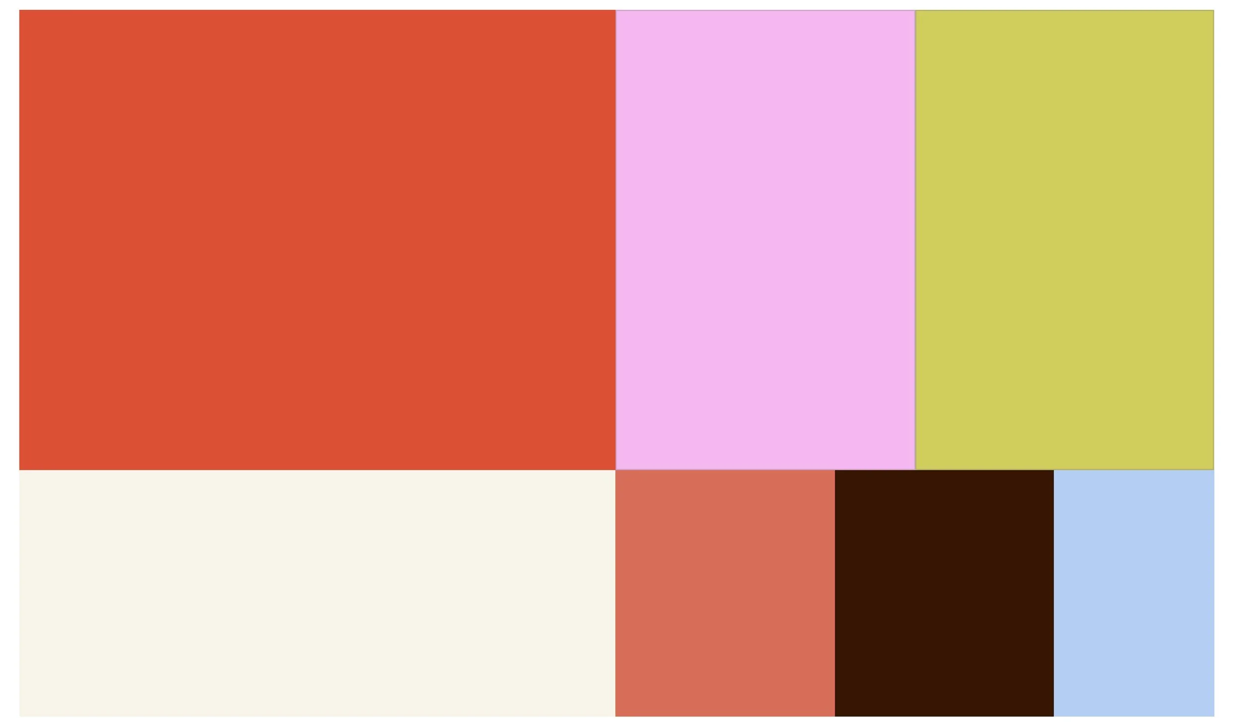
COLOR
The palette was built around hope and resilience — warm, inviting tones that feel approachable without undercutting the seriousness of the mission.
ILLUSTRATION
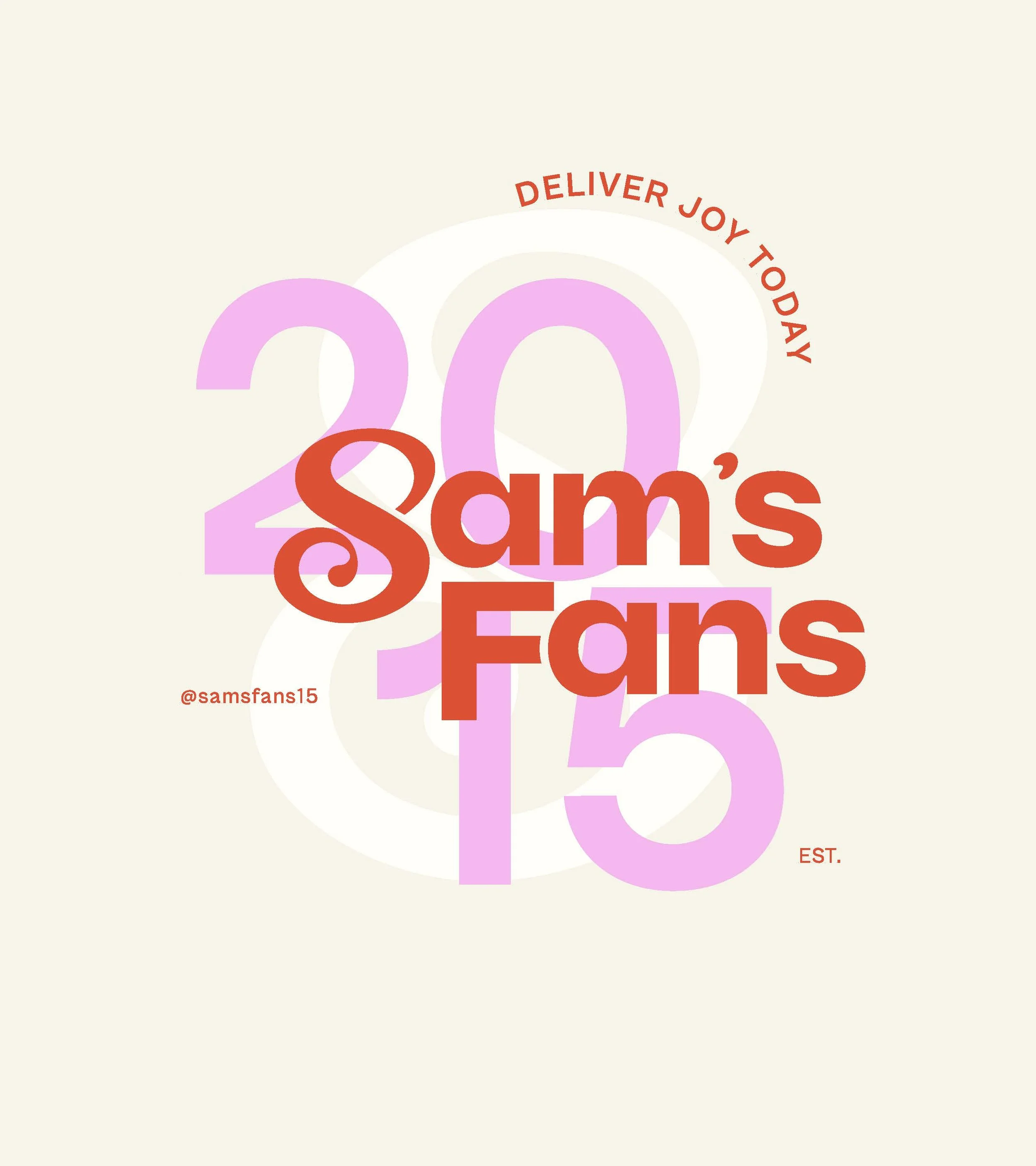
A custom horror-drip word-mark for the brand name, paired with stacked all-caps slab type for the tagline.
COLLABORATION
Custom artwork that honored Sam's personality and spirit, distinct from stock-style charity imagery.
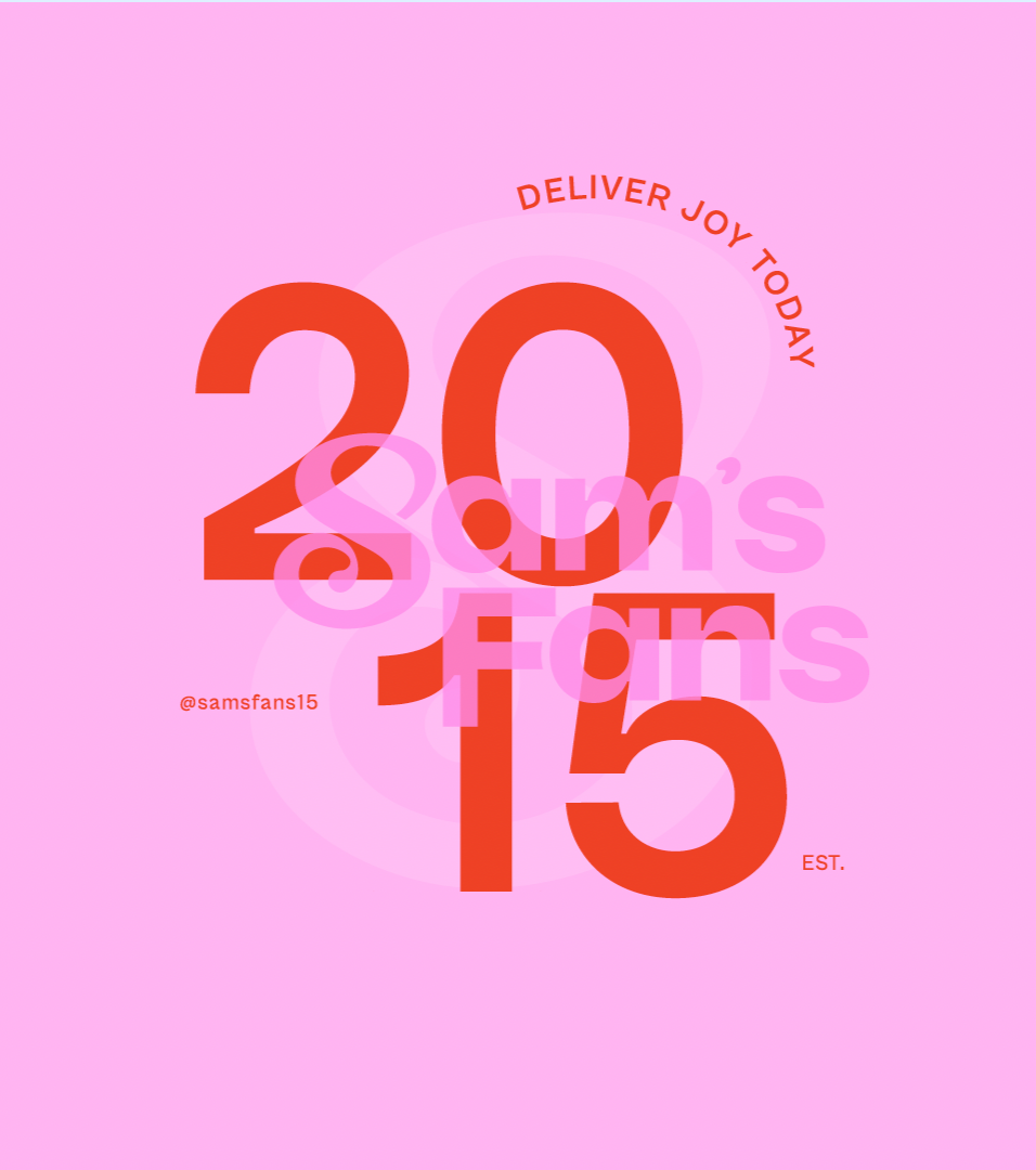
CONSISTANCY
Social assets were designed as a system, not individual pieces, so the brand reads as unified across every touchpoint.